22. 4. 2022
17 min read
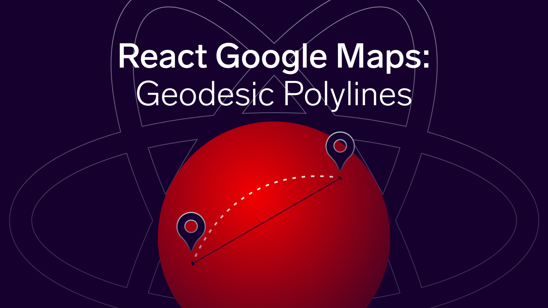
React Google Maps Geodesic Polylines, Polygons
The Google Directions service API has 4 modes to choose from - driving, walking, cycling, and transit. Interestingly, this service does not include flights - and this is precisely what we are going to be focused on this time.
Pavlo Chabanenko

This is a logical continuation of my first article dedicated to React Google Maps. There we learned most basics and lots of the tools and techniques needed for a wide range of tasks such as using markers, info windows, directions services (using multiple directions at a time), setting proper zoom and map styles, etc. You can familiarize yourself with all these things by clicking here, but it is also important to mention that we will not go into details about the aspects thoroughly described in my first article in order to avoid self-citation and unnecessary repetitions. But, of course, I will always point you to a particular place where you can learn more about such things in case you are a new reader or forgot some details and are willing to refresh your memory.
Prerequisites
Just as before, it is still essential that you create your API key and enable 3 APIs in the Google Cloud console: Maps JavaScript API, Geocoding API, and Places API. Since the current article is a natural addition to the first one, we are going to use the same library react-google-maps as well as the previous project's setup and base that you can find in my repository.
It is also worth mentioning that I use styled-components and styled-system, so being familiar with its syntax and layout principles will help you a lot along the way. And, finally, this project is built with Gatsby just as before, but you can learn how to create a new React app here if you mind using Gatsby.
What we are going to implement
In the previous article, we had some markers on the map representing origins and destinations. Once one of the origin markers got clicked, it changed its state from inactive to active, and DRIVING directions to all our destinations were beautifully displayed. As you can remember, the Directions service API has 4 modes to choose from - driving, walking, cycling, and transit. Interestingly, this service does not include flights - and this is precisely what we are going to be focused on this time.
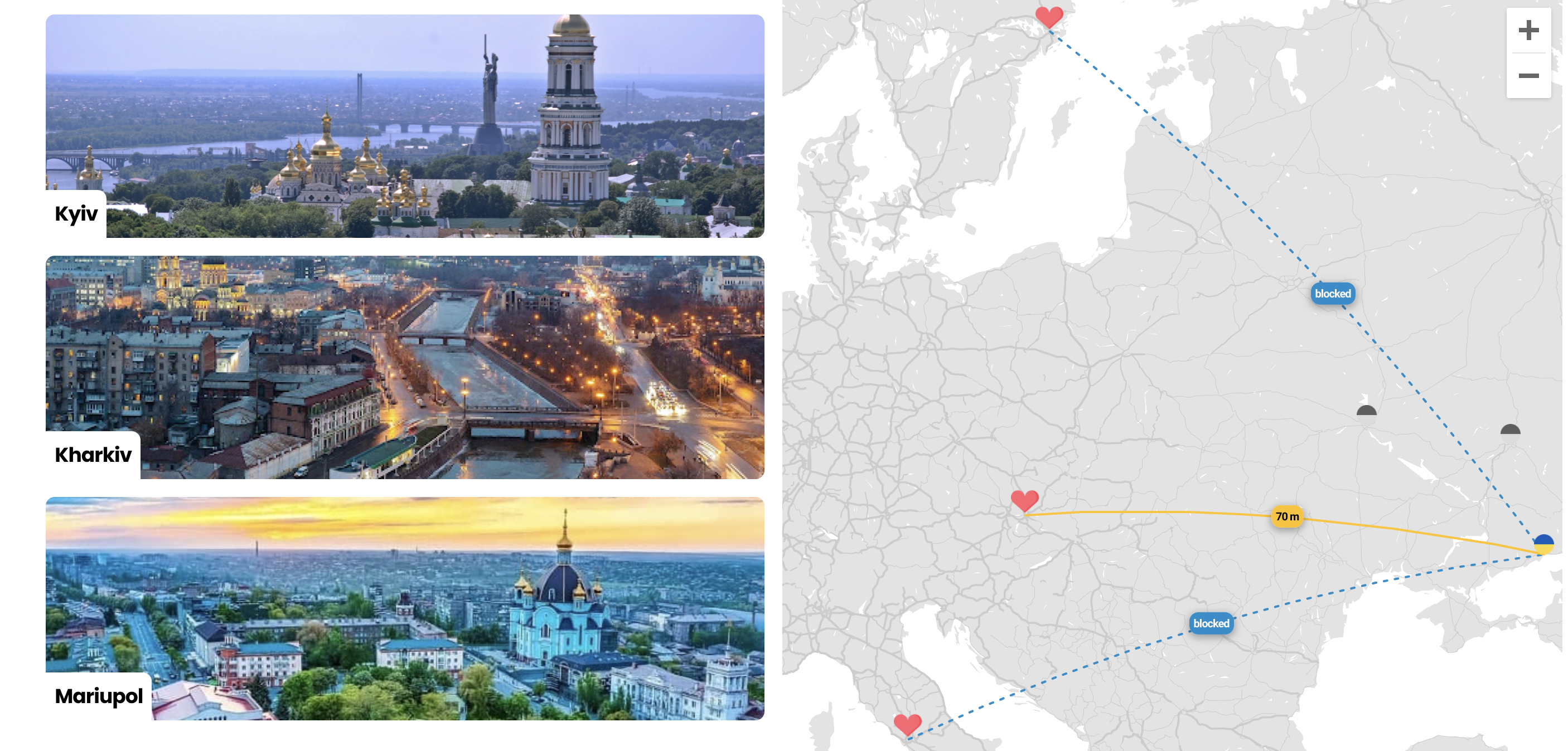
As a footnote, this article was not going to be related to politics in any way, but taking into account the terrible war in Ukraine and the fact that I am Ukrainian, I decided to implement this project in relation to my homeland and thus support it and attract your attention to this tragedy. In addition, I believe it is a good idea to remind ourselves how beautiful Ukraine was before this tragedy.
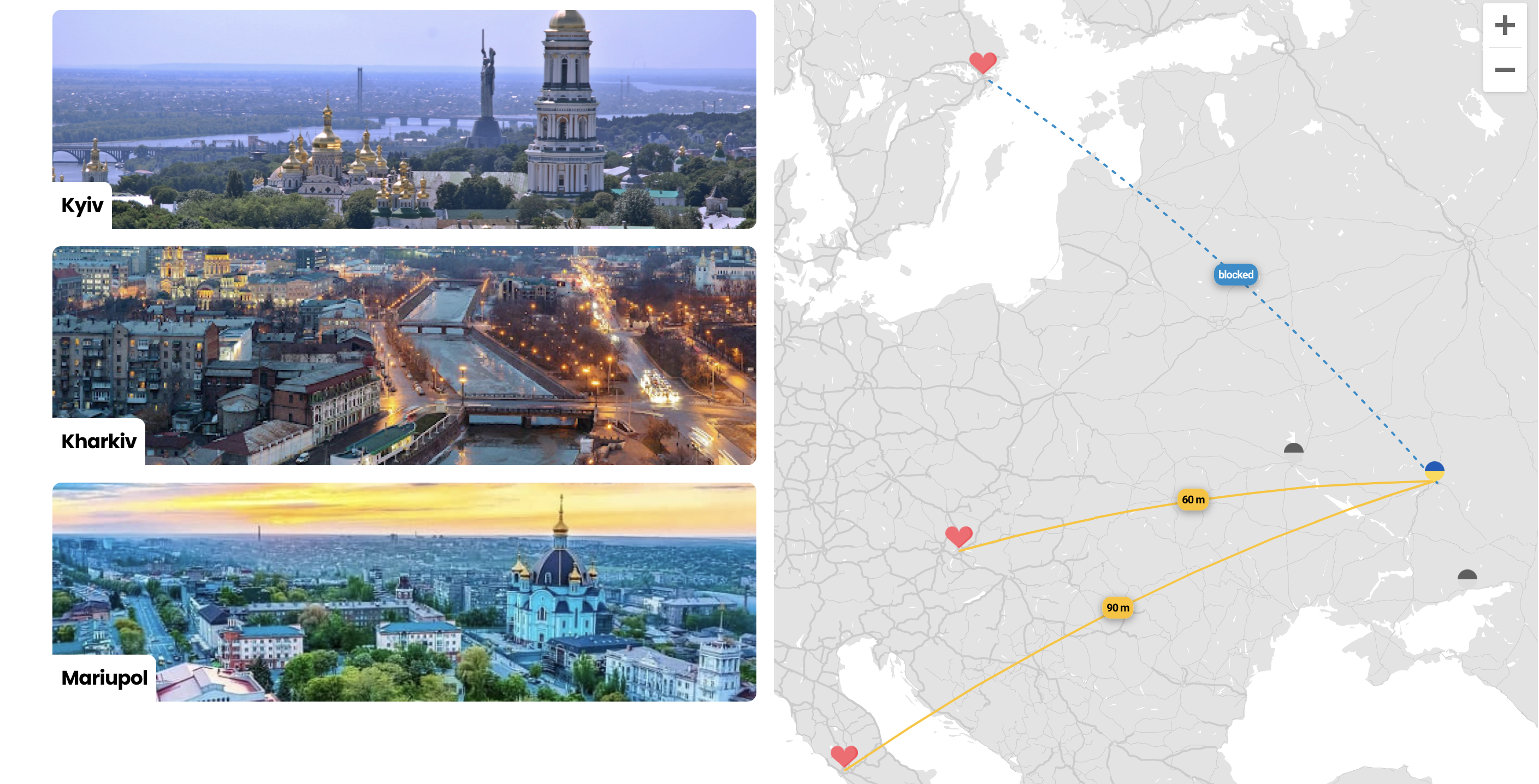
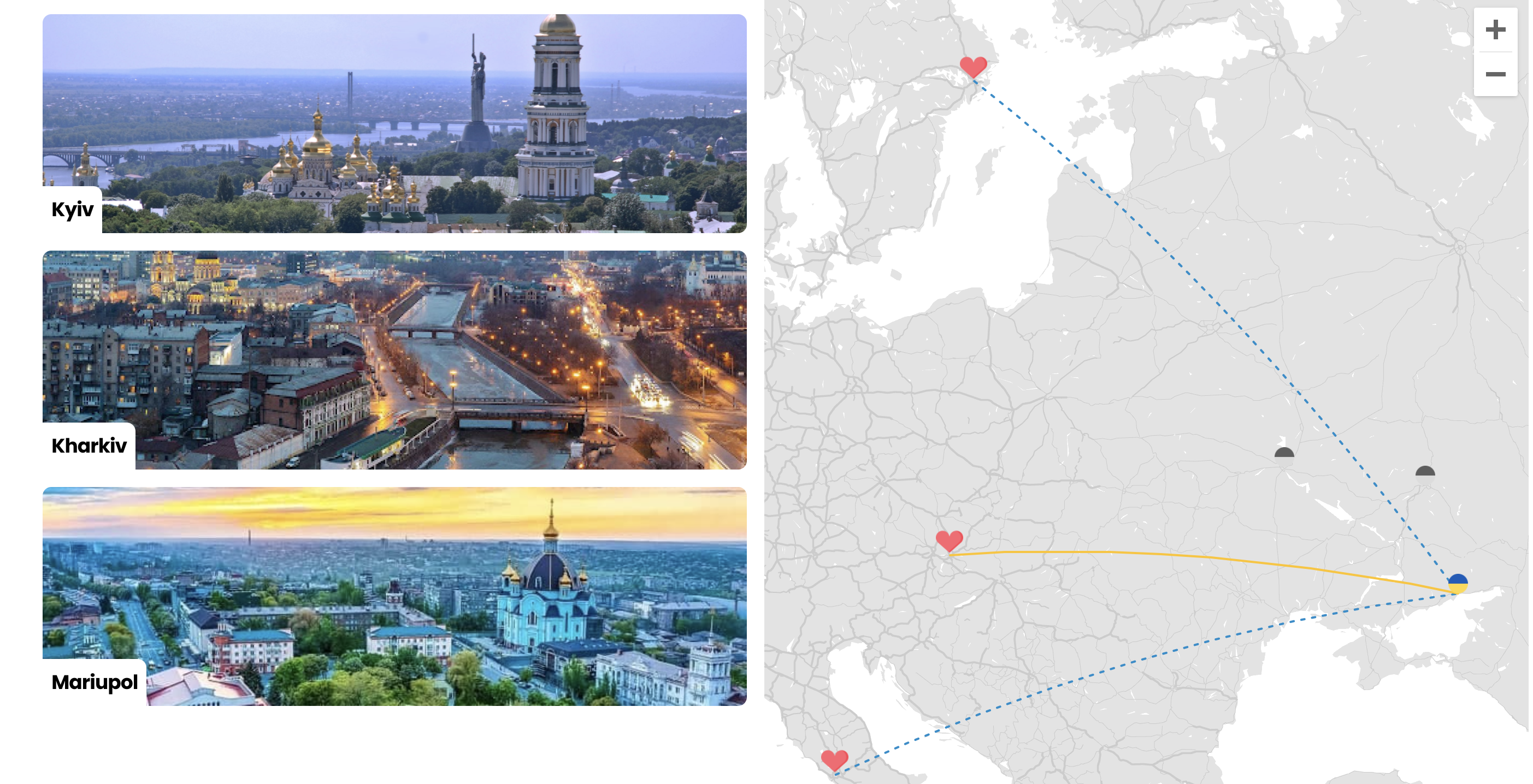
So, just like before we will have origin and destination markers - these will be represented by 3 Ukrainian cities that are suffering the most from the Russian aggression - Kyiv, Kharkiv, and Mariupol, and we will display them on the map as Ukrainian flags. The destination markers will be displayed as hearts and will indicate the capitals of my 3 favorite countries - Slovakia (Bratislava), Italy (Rome), and Sweden (Stockholm). Once one of the above-mentioned origin markers (Ukrainian cities) is clicked, 3 curved lines will connect the origin and the destination markers imitating flight paths. Furthermore, we will complicate the task a bit and make it closer to the needs of a real project by adding a flight availability param - if a flight is available, the line will be whole and integral, otherwise, we will display a dashed line. And, of course, you may want to provide a user with some additional information about your flight - that is why we will display a bubble indicating proper travel time, and we will find a way to put it right above the line center. Just like in our first project we will have a standard layout that can be seen in Airbnb or Booking: there will be a card list on the left-hand side and a map itself just beside it. The logic above will work not only by clicking on origin markers positioned on the map but also by hovering over respective origin cards - they will display those 3 Ukrainian cities I mentioned above.

Creating mock data and making the first steps
As usual, we need to install react-google-maps - write this in your terminal inside your project folder:
npm i react-google-maps
Then we need to create our mock data that will be used in our project:
export const MOCK_ORIGINS_DATA = [ { id: 1, title: 'Kyiv', coordinates: { lat: 50.450001, lon: 30.523333 }, src: 'https://upload.wikimedia.org/wikipedia/commons/5/5b/Lavra_Kyiv.JPG', flights: [ { id: 4, duration: 75, isAvailable: true }, { id: 5, duration: 80, isAvailable: true }, { id: 6, duration: 50, isAvailable: true }, ], }, { id: 2, title: 'Kharkiv', coordinates: { lat: 49.988358, lon: 36.232845 }, src: 'https://images.novyny.live/images/thumbnail/1366x570/613a3b31dca30-khar-kov-15.jpg', flights: [ { id: 4, duration: 85, isAvailable: false }, { id: 5, duration: 90, isAvailable: true }, { id: 6, duration: 60, isAvailable: true }, ], }, { id: 3, title: 'Mariupol', coordinates: { lat: 47.097133, lon: 37.543367 }, src: 'https://pr.ua/userfiles/news/2021/06/onegina/marnyrdjrjgi.jpg', flights: [ { id: 4, duration: 95, isAvailable: false }, { id: 5, duration: 100, isAvailable: false }, { id: 6, duration: 70, isAvailable: true }, ], },]export const MOCK_DESTINATIONS_DATA = [ { id: 4, coordinates: { lat: 59.3369241797981, lon: 18.068564023967703 }, }, { id: 5, coordinates: { lat: 41.902782, lon: 12.496366 }, }, { id: 6, coordinates: { lat: 48.148598, lon: 17.107748 }, },]We are going to pass to our components 2 arrays - MOCK_ORIGINS_DATA and MOCK_DESTINATIONS_DATA (let's call them just origins and destinations). Destinations have a simpler shape due to the fact that we basically need just their coordinates in order to place a marker on the map. So, looking closer at origins will help us better understand how things will work:
both
titleandsrcare needed for the card list onlycoordinatesare needed to display destination markers on the map - just the way we need them for displaying originsflightsis an array of objects that have the following structure:idof the respective destination (4 - Stockholm, 5 - Rome, 6 - Bratislava),duration, andisAvailable- flight duration and its availability from the defined origin to either of the three destinations. The file with this mocked data is called data.js and can be found here.
Now we have to define some important constants that you may well be familiar with from the previous article - these are the params needed for the GoogleMap.
import { COLOR } from 'Theme'
export const GOOGLE_MAP_URL = `https://maps.googleapis.com/maps/api/js?v=3.exp&libraries=geometry,drawing,places&key=${process.env.GATSBY_GOOGLE_KEY}`
export const MAP_SETTINGS = {  DEFAULT_MAP_OPTIONS: {    scrollwheel: false,    mapTypeControl: false,    fullscreenControl: false,    streetViewControl: false,  },  DEFAULT_CENTER: { lat: 57, lng: 20 },  DEFAULT_ZOOM: 4,  MARKER_SIZE: {    SMALL: 18,    LARGE: 25,  },  PIXEL_OFFSET: {    X: 0,    Y: 20,  },//   POLYLINE_OPTIONS: {//     DASHED: {//       geodesic: true,//       strokeOpacity: 0,//       strokeWeight: 2,//       strokeColor: COLOR.OLYMPIC_BLUE,//       icons: [//         {//           icon: {//             path: 'M 0,0 0,1',//             strokeOpacity: 1,//             strokeWeight: 2,//             scale: 3,//           },//           offset: '0',//           repeat: '10px',//         },//       ],//     },//     REGULAR: {//       geodesic: true,//       strokeOpacity: 1,//       strokeWeight: 2,//       strokeColor: COLOR.YELLOW_STAGSHOR,//     },//   },}
For now, we will comment out the POLYLINE_OPTIONS - we will use them when adding the actual polylines (flight paths). Should you need to refresh your memory or learn more about the rest of the options - DEFAULT_MAP_OPTIONS, DEFAULT_CENTER, DEFAULT_ZOOM and marker-related options, you can go to the Setting data, constants and making first steps section in my React Google Maps article and dive into their detailed description. You can also see the GOOGLE_MAP_URL that has to be used in order to initialize our Map component. You can also see that it contains the GATSBY_GOOGLE_KEY which is actually the API key that we created at the beginning of the article.
Creating layout and basic components
Now, let's create the necessary layout and our map component with most of the settings we are going to be in need of. First of all, we will add to our routes/home directory a Card.js file with the following code:
import React from 'react'import PropTypes from 'prop-types'import styled from 'styled-components'import { rem } from 'polished'import { COLOR, SPACE, FONT_SIZE, FONT_WEIGHT, RADIUS } from 'Theme'import { Text } from 'components/Typography'import { Box } from 'components/Layout'
const IMAGE_HEIGHT = rem(200)
const LocationImage = styled('div')`  height: ${IMAGE_HEIGHT};  border-radius: ${RADIUS.L};  ${({ src }) => `     background: url("${src}") center / cover no-repeat;  `}`
export const TitleWrapper = styled('div')`  border-top-right-radius: ${RADIUS.L};  background-color: ${COLOR.WHITE};  padding: ${SPACE.S};`
const Card = ({ id, title, onHover, src }) => (  <Box    onMouseEnter={() => onHover(id)}    onMouseLeave={() => onHover(null)}    position="relative"    my={SPACE.M}  >    <LocationImage src={src} />    <Box position="absolute" bottom={0}>      <TitleWrapper>        <Text          as="p"          fontSize={FONT_SIZE.L}          fontWeight={FONT_WEIGHT.BOLD}          color={COLOR.BLACK}        >          {title}        </Text>      </TitleWrapper>    </Box>  </Box>)
export default Card
This Card component is very similar to the one used in the previous article. Here we pass title and src to display origin images (images of the 3 Ukrainian cities) and the city names, while id and onHover are needed to define what card/origin is hovered on.
The next component we need to create is our Map component where all the magic is going to take place. Let's create it inside the routes/home/Map folder in a Map.js file:
import React from 'react'import PropTypes from 'prop-types'import {  Marker,  // Polyline,  GoogleMap,  // InfoWindow,  withScriptjs,  withGoogleMap,} from 'react-google-maps'import heartIcon from 'images/heart.png'import locationIconActive from 'images/location-active.png'import locationIconInactive from 'images/location-inactive.png'import { MAP_SETTINGS } from 'constants/constants'import mapStyles from './mapStyles.json'
const {  DEFAULT_ZOOM,  DEFAULT_CENTER,  DEFAULT_MAP_OPTIONS,  MARKER_SIZE,  // PIXEL_OFFSET,  // POLYLINE_OPTIONS,} = MAP_SETTINGS
const MapContainer = ({ origins, destinations, hoveredOriginId }) => {  const mapRef = React.useRef(null)
  const [selectedOriginId, setSelectedOriginId] = React.useState(null)
  React.useEffect(() => {    const bounds = new window.google.maps.LatLngBounds()    origins.forEach(({ coordinates: { lat, lon } }) => {      bounds.extend(new window.google.maps.LatLng(lat, lon))    })    destinations.forEach(({ coordinates: { lat, lon } }) => {      bounds.extend(new window.google.maps.LatLng(lat, lon))    })    mapRef.current.fitBounds(bounds)  }, [destinations, origins])
  React.useEffect(() => {    if (hoveredOriginId) {      setSelectedOriginId(null)    }  }, [hoveredOriginId])
  const selectedOrigin = origins.find(    ({ id }) => selectedOriginId === id || hoveredOriginId === id  )
  return (    <GoogleMap      ref={mapRef}      defaultZoom={DEFAULT_ZOOM}      defaultCenter={DEFAULT_CENTER}      defaultOptions={{ ...DEFAULT_MAP_OPTIONS, styles: mapStyles }}    >      {origins.map(({ coordinates: { lat, lon: lng }, id }) => (        <Marker          key={id}          position={{ lat, lng }}          icon={{            url:              id === selectedOrigin?.id                ? locationIconActive                : locationIconInactive,            scaledSize: new window.google.maps.Size(              MARKER_SIZE.SMALL,              MARKER_SIZE.SMALL            ),          }}          onClick={() => {            setSelectedOriginId(id)          }}        />      ))}
      {destinations.map(({ coordinates: { lat, lon: lng }, id }) => (        <Marker          key={id}          position={{ lat, lng }}          icon={{            url: heartIcon,            scaledSize: new window.google.maps.Size(              MARKER_SIZE.LARGE,              MARKER_SIZE.LARGE            ),          }}        />      ))}    </GoogleMap>  )}
export default withScriptjs(withGoogleMap(MapContainer))
As you probably noticed, I commented out some lines of code: Polyline and InfoWindow modules, PIXEL_OFFSET and POLYLINE_OPTIONS that we will use a bit later.
You can see that we declared selectedOriginId and setSelectedOriginId - this useState is needed to save the id of the origin marker that was clicked/selected on the map. We also use the setSelectedOriginId inside a useEffect where we check if the hoveredOriginId param exists - if it does (user hovered over one of the origin cards), we set the selectedOriginId to null. Another bit of code we are interested in is related to the selectedOrigin - here we get the origin data based on selectedOriginId or hoveredOriginId meaning a user either clicked on one of the origin icons or hovered over a respective origin card.
The first useEffect deals with the bounds of the map - you can read more about what is going on there in the Setting zoom section of the previous article. In short, this section of code helps us set the correct zoom of the map in order to make sure all the markers of the map are seen and placed within the map's boundaries and no elements we want to display are missing.
More details about the use of the Marker module can also be found in the Setting data, constants and making first steps section of the above-mentioned article. To put it in a nutshell, we use destinations and origins params passed to the MapContainer in order to map through them, extract coordinates needed to correctly display our markers on the map, and then pass the necessary active and inactive icons to the Marker module. We also pass setSelectedOriginId to onClick callback to save the id of the selected/clicked origin marker.
Now when the basic MapContainer (which actually represents our Map) is ready we need to create the index.js file in the same folder with the following code:
import React from 'react'import styled from 'styled-components'import { GOOGLE_MAP_URL } from 'constants/constants'import { Box } from 'components/Layout'import MapContainer from './Map'
const MapWrapper = styled(Box)`  position: sticky;  top: 0;  height: 100vh;`
const MapElement = styled(Box)`  .gm-ui-hover-effect {    display: none !important;  }  .gm-style .gm-style-iw-t::after {    display: none;  }  .gm-style-iw.gm-style-iw-c {    padding: 0;    .gm-style-iw-d {      overflow: hidden !important;    }  }  .gmnoprint.gm-bundled-control.gm-bundled-control-on-bottom {    top: 0;  }`
const Map = (props) => (  <MapWrapper>    <MapContainer      googleMapURL={GOOGLE_MAP_URL}      loadingElement={<Box height="100%" />}      containerElement={<Box height="100%" />}      mapElement={<MapElement height="100%" />}      {...props}    />  </MapWrapper>)
export default Map
If you are new to React Google Maps, you can learn about loadingElement, containerElement, mapElement and rewriting CSS styles in MapWrapper in the Changing native CSS rules section of my first article. I would also like to pay your attention to the fact that we import the GOOGLE_MAP_URL set in the constants.js file that we discussed earlier - that string is needed to initialize our map and holds the API key.
The next component that we need to create is the ListMapSection that I placed in the routes/home directory:
import React from 'react'import styled from 'styled-components'import { rem } from 'polished'import { SPACE } from 'Theme'import { Flex, Box } from 'components/Layout'import Map from './Map'import Card from './Card'import { MOCK_ORIGINS_DATA, MOCK_DESTINATIONS_DATA } from './data'
const CONTENT_WIDTH = rem('675px')
const ListWrapper = styled('div')`  flex: 1;  min-width: 0;  max-width: ${CONTENT_WIDTH};`
const List = styled('div')`  width: 100%;  margin-left: auto;  padding: 0 ${SPACE.M} ${SPACE.M};  max-width: ${CONTENT_WIDTH};`
const ListMapSection = () => {  const [hoveredOriginId, setHoveredOriginId] = React.useState(null)  return (    <Flex>      <ListWrapper>        <List>          {MOCK_ORIGINS_DATA.map((originData) => (            <Card              key={originData.id}              onHover={setHoveredOriginId}              {...originData}            />          ))}        </List>      </ListWrapper>      <Box flex={1}>        <Map          origins={MOCK_ORIGINS_DATA}          destinations={MOCK_DESTINATIONS_DATA}          hoveredOriginId={hoveredOriginId}        />      </Box>    </Flex>  )}
export default ListMapSection
This is also exactly the same component I used in my first article. Here we divide the screen in 2 parts - the first one holds our cards with origins (3 Ukrainian cities), while the second one has the map we have created earlier. Here we declare the setHoveredOriginId useState that we pass as onHover to the Cards that are subsequently mapped based on the MOCK_ORIGINS_DATA. The hoveredOriginId is passed to our Map component and holds the id of the hovered origin Card. We also pass both MOCK_ORIGINS_DATA and MOCK_DESTINATIONS_DATA to the Map component to display our destination and origin markers as well as polylines that we will implement in the next section.
Adding polylines - flight paths
Now it is time to add polylines - a tool that can help us draw lines (flight paths) on the canvas of our map. But first of all, we need to uncomment the POLYLINE_OPTIONS that we commented out before in the constants.js file and run through them:
export const MAP_SETTINGS = { DEFAULT_MAP_OPTIONS: { scrollwheel: false, mapTypeControl: false, fullscreenControl: false, streetViewControl: false, }, DEFAULT_CENTER: { lat: 57, lng: 20 }, DEFAULT_ZOOM: 4, MARKER_SIZE: { SMALL: 18, LARGE: 25, }, PIXEL_OFFSET: { X: 0, Y: 20, }, POLYLINE_OPTIONS: { DASHED: { geodesic: true, strokeOpacity: 0, strokeWeight: 2, strokeColor: COLOR.OLYMPIC_BLUE, icons: [ { icon: { path: 'M 0,0 0,1', strokeOpacity: 1, strokeWeight: 2, scale: 3, }, repeat: '10px', }, ], }, REGULAR: { geodesic: true, strokeOpacity: 1, strokeWeight: 2, strokeColor: COLOR.YELLOW_STAGSHOR, }, },}As you can see, the POLYLINE_OPTIONS object has 2 keys: DASHED and REGULAR. The REGULAR key represents the rules needed to draw a solid and integral line:
strokeOpacity: either 1 or 0, the opacity of the line
strokeWeight: integer, the width of the line
strokeColor: the color of the line
geodesic: bool, when set to true, the line is displayed as geodesic - a curved line that imitates the round shape of the Earth. However, if the distance between two dots is quite short, the line will still be straight.
path: string, defines a symbol using SVG path notation
repeat: string, repeats the symbol at intervals of n pixels to create the dashed effect.
scale: integer, scale the line/symbol
You could also notice that the dashed line is created by passing the symbol in the icons property, while the line is given an opacity of 0. Then we repeat the symbol at intervals of 10 pixels to create the dashed effect. And, of course, the dashed line is also geodesic and thus this param is also set to true.
Now we need to move to the Map.js file, uncomment the import of the Polyline module, POLYLINE_OPTIONS that we destructure from the MAP_SETTINGS, and add the following block of code just where we use our Marker modules:
{selectedOrigin && destinations.map(({ id, coordinates }) => { const { isAvailable } = selectedOrigin.flights.find( (flight) => flight.id === id ) return ( <Polyline key={id} path={getLatLngPolyline({ origin: selectedOrigin.coordinates, destination: coordinates, })} options={ isAvailable ? POLYLINE_OPTIONS.REGULAR : POLYLINE_OPTIONS.DASHED } /> ) })}In the code snippet above you can see the usage of the Polyline module. This module enables us to draw the lines from the selectedOrigin (one of the Ukrainian cities, either clicked or hovered) to all 3 destinations - Bratislava, Stockholm, and Rome. As you may remember, we also decided to draw a dashed line in case a certain flight is not available. This availability is checked when mapping through all 3 destinations and destructuring isAvailable value from the selectedOrigin.flights array of objects, based on the destination id.
The most important params in the Polyline module are path and options. Since we need to create either a normal or a dashed line based on the isAvailable value, we use either POLYLINE_OPTIONS.REGULAR or POLYLINE_OPTIONS.DASHED options that we declared in the constants above. The path accepts an array with 2 objects that must have 2 keys: lat and lng. This is the place where we tell our Polyline module the coordinates between the 2 markers that we want to connect via a geodesic polyline. For this reason, we can create a helper function to handle that for us and place it above the declaration of our MapContainer.
const getLatLngPolyline = ({ origin, destination }) => [ { lat: origin.lat, lng: origin.lon }, { lat: destination.lat, lng: destination.lon },]The above function accepts 2 arguments - origin and destination that are objects that hold latitude and longitude of our origin and destination markers. So, in each case, we always have just 1 origin - a marker that was selected by a user or a card that was hovered over, and thus we use selectedOrigin.coordinates to pass as an origin argument, while the rest of the coordinates we destructure from our destinations array.

Adding labels with flight duration and center them above geodesic polylines
Now that we have our polylines set, we would also like to place some labels over them and provide a user with some additional information - in our case, it will be flight duration from one of the selected origins to each of the destinations. This can be achieved by using the InfoWindow module. As you may remember from the previous article we used the InfoWindow in order to display a window above a clicked marker. The window contained a photo of the selected city and its name. You can read more about InfoWindows in the Adding InfoWindow, Card List and Layout section in my previous article.

In this section we will add our InfoWindow with similar functionality:
to pop up along with polylines when origin markers are clicked on
to get removed if a particular card from the card list is hovered on
to have click outside logic, that closes our InfoWindow
to disable click outside functionality when dragging the map so that we can adjust the map canvas without closing the InfoWindow and its respective polylines
First of all, let's create a simple InfoWindow component that will represent our label with either a flight duration (e.g. 70 m) or the 'blocked' text in case a flight is not available, and place this component in routes/home/Map folder:
import React from 'react'import PropTypes from 'prop-types'import styled from 'styled-components'import { rem } from 'polished'import { Flex } from 'components/Layout'import { COLOR, FONT_SIZE, FONT_WEIGHT, SPACE } from 'Theme'import { Text } from 'components/Typography'
const HEIGHT = rem(20)
const Bubble = styled(Flex)` align-items: center; justify-content: center; height: ${HEIGHT};`
const StyledText = styled(Text)` font-size: ${FONT_SIZE.XXS}; font-weight: ${FONT_WEIGHT.SEMI_BOLD};`
const InfoWindow = ({ flightDuration, isFlightAvailable }) => ( <Bubble   bg={isFlightAvailable ? COLOR.YELLOW_STAGSHOR : COLOR.OLYMPIC_BLUE}   p={SPACE.XS} >   <StyledText color={isFlightAvailable ? COLOR.BLACK : COLOR.WHITE}>     {isFlightAvailable ? `${flightDuration} m` : 'blocked'}   </StyledText> </Bubble>)
InfoWindow.propTypes = { flightDuration: PropTypes.number.isRequired, isFlightAvailable: PropTypes.bool.isRequired,}
export default InfoWindow
Now when we have our InfoWindow content, we need to install a library react-outside-click-handler. You can do that by typing in your terminal inside your project folder: npm i react-outside-click-handler.
Once installed, we need to uncomment the import of the InfoWindow module from 'react-google-maps', uncomment the PIXEL_OFFSET destructured from MAP_SETTINGS, then import both OutsideClickHandler and InfoWindowContent inside our Map.js, and finally add this code below our Polyline:
{selectedOrigin && destinations.map(({ id, coordinates }) => { const { flights } = selectedOrigin const { duration, isAvailable } = flights.find( (flight) => flight.id === id ) return ( <InfoWindow key={id} position={getLineCenter({ origin: selectedOrigin.coordinates, destination: coordinates, })} options={{ pixelOffset: new window.google.maps.Size( PIXEL_OFFSET.X, PIXEL_OFFSET.Y ), }} > <OutsideClickHandler onOutsideClick={() => { setSelectedOriginId(null) }} disabled={isClickOutsideDisabled} > <InfoWindowContent flightDuration={duration} isFlightAvailable={isAvailable} /> </OutsideClickHandler> </InfoWindow> ) })}We also need to declare another useState:
const [isClickOutsideDisabled, setIsClickOutsideDisabled] = React.useState( false )And finally let's pass onDragStart and onDragEnd to our GoogleMap module:
<GoogleMap ref={mapRef} defaultZoom={DEFAULT_ZOOM} defaultCenter={DEFAULT_CENTER} defaultOptions={{ ...DEFAULT_MAP_OPTIONS, styles: mapStyles }} //Just added onDragStart={() => setIsClickOutsideDisabled(true)} onDragEnd={() => setIsClickOutsideDisabled(false)} >Now let's take a closer look at what is actually going on in our newly added code. In order to display the label we created in the InfoWindow.js file (which we imported as InfoWindowContent), we need to place it inside the native InfoWindow module imported from react-google-maps. And to implement our click outside functionality, we need to wrap the InfoWindowContent with the OutsideClickHandler. Just as we did in my previous article, we need to pass to the handler 2 parameters - onOutsideClick callback where we set selectedOriginId to null, hence closing our InfoWindow, and disabled - a boolean to indicate where we need to disable our OutsideClickHandler handler. As you may notice, we also added 2 important changes to our GoogleMap module: we pass () => setIsClickOutsideDisabled(true) to onDragStart and () => setIsClickOutsideDisabled(false) to onDragEnd and thus either enable or disable the OutsideClickHandler by setting its disabled parameter to isClickOutsideDisabled. This change helps us not to remove polylines on dragging the map because normally users want to have elements untouched when using dragging gestures, but we normally want things closed on clicking outside our elements.
Our InfoWindowContent component (a label above a polyline) requires 2 parameters - flightDuration and isFlightAvailable to display either the actual duration or 'blocked'. We can get this data from our selectedOrigin.flights array by extracting duration and isAvailable values just the way we destructered isAvailable when displaying polylines.
As you can remember, InfoWindow accepts 2 parameters - position and options. As always, you can read more about that from my previous article, but for now, we are going to focus on position only. If we wanted to place our info windows over origin markers (that is what we did in the previous article), we would use the coordinates of our origin markers:
position={{ lat: selectedOrigin.coordinates.lat, lng: selectedOrigin.coordinates.lon,}}But in our case, we need to display our labels between 2 dots - the selected origin marker and the destination marker, and that has to be repeated 3 times in that we have 3 destinations on the map - Rome, Bratislava, and Stockholm. Furthermore, we need to place them right in the middle. That means we need the coordinates of both dots that are interconnected with a polyline, and a certain way to get the final coordinates for our InfoWindow (label) that will be subsequently passed as a position parameter. Let's create a getLineCenter helper function and place it above the MapContainer component declaration:
const getLineCenter = ({ origin, destination }) => window.google.maps.geometry.spherical.interpolate( new window.google.maps.LatLng(origin.lat, origin.lon), new window.google.maps.LatLng(destination.lat, destination.lon), 0.5 )In the function above we used one of the google.maps.geometry.spherical utility functions for computing geodesic angles, distances, and areas. The function that we used is called interpolate and accepts 3 arguments:
from: LatLng
to: LatLng
fraction: number from 0 to 1
interpolate returns the LatLng which lies the given fraction of the way between the origin LatLng and the destination LatLng. We also set the fraction to 0.5 in order to get the center between our origin and destination.
Our getLineCenter helper function also accepts 2 arguments - origin and destination that both hold the needed coordinates of our selected Ukrainian city and our destination - either Rome, Bratislava or Stockholm.

Polygons
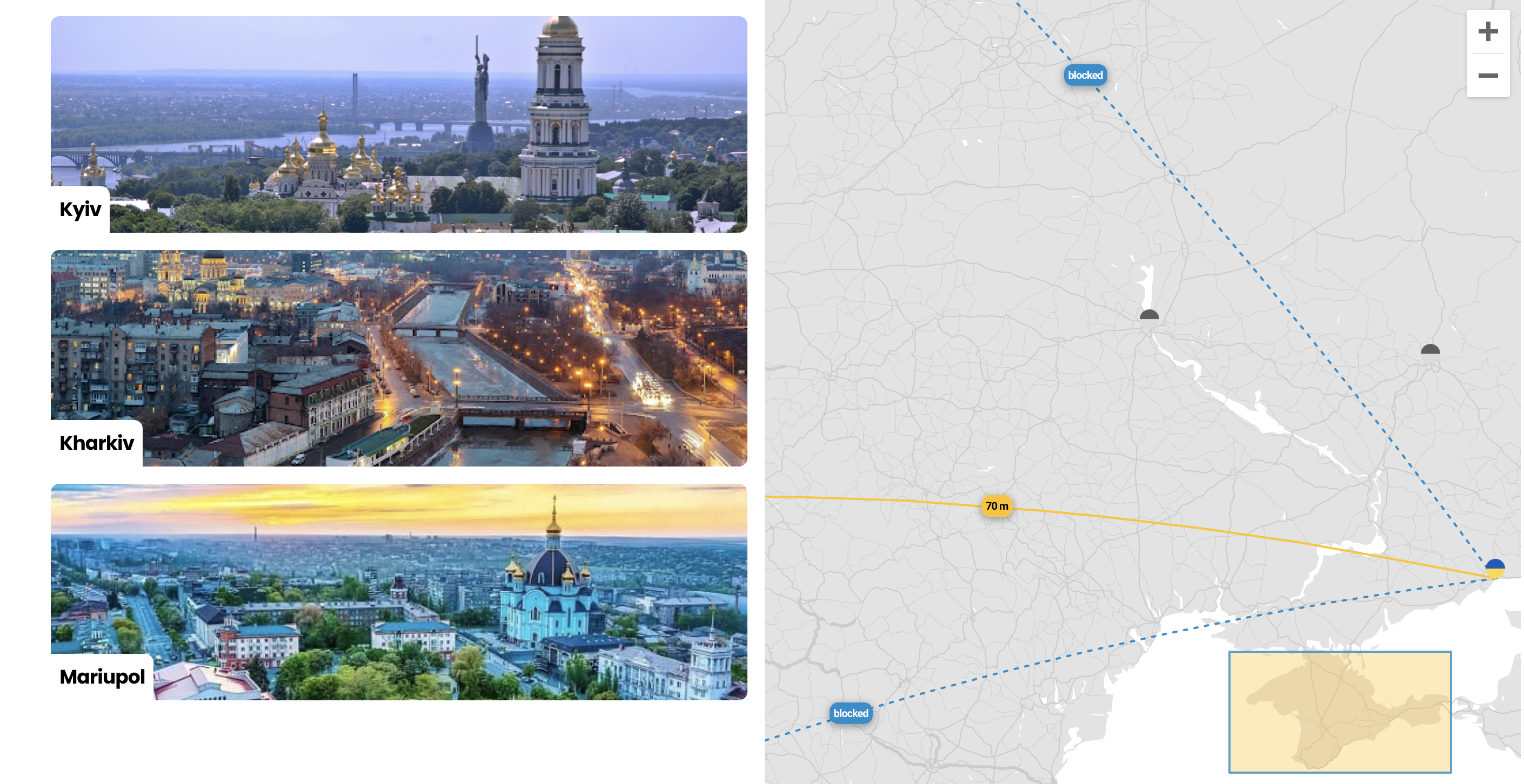
This section is not compulsory and is a bonus just to show you some additional drawing capabilities that can come in handy. Apart from directions and flight paths React Google Maps library affords us an opportunity to draw things on our map in case we need to single out wider areas like drawing a geometric triangle over the Bermuda Triangle.
As you may know, Russia annexed the Crimean peninsular in 2014. So, since this article has a patriotic mood, I decided to exemplify the above-mentioned drawing capabilities by creating a polygon over Crimea. This polygon will have blue borders and will be filled with yellow just as Ukrainian national flag. This will also demonstrate that Crimea is an integral part of Ukraine.
So, let's go to our constants.js file and add to the MAP_SETTINGS object the following key:
POLYGON: { PATHS: [ { lat: 44.337799, lng: 36.640032 }, { lat: 44.337799, lng: 32.142806 }, { lat: 46.070955, lng: 32.142806 }, { lat: 46.070955, lng: 36.640032 }, ], OPTIONS: { strokeWeight: 2, strokeOpacity: 0.8, strokeColor: COLOR.OLYMPIC_BLUE, fillOpacity: 0.35, fillColor: COLOR.YELLOW_STAGSHOR, }, },The PATHS is an array that contains the coordinates of our quadrangle's apices, while OPTIONS are needed to add some styles like color, stroke weight, etc.
Now, let's move to the Map.js file and destructure POLYGON from MAP_SETTINGS. We must also remember to import a Polygon module from react-google-maps. Now we are ready to add our Polygon just like we added the rest of the modules - Marker, Polyline, InfoWindow:
<Polygon paths={POLYGON.PATHS} options={POLYGON.OPTIONS} />Now when everything is properly set you are supposed to see the following result:

Summary
React Google Maps is a powerful and relatively simple tool aimed at working with Google Maps. It enables us to efficiently work with Google Maps services and implement everything you might expect from a modern map - displaying directions (driving, walking, cycling, and transit), adding polylines that normally represent flight paths/trajectories, info windows, markers, drawing polygons, etc. You are also offered a variety of tools to style your map in order to meet your project's designs. Even so, the documentation can be somewhat confusing and frustrating, and that is why I saw it as essential that we have a series of articles to cover most of the functionality and settings needed to implement a fully functional and modern map just as the ones used by Booking or Airbnb. The code of a complete project can be found here - you can use it as a playground and experiment with different modules and settings. Please, don't forget to create a .env.development file in the root of your project and place a valid API key there: GATSBY_GOOGLE_KEY='your valid key'.


