21. 9. 2023
28 min read
React Google Maps: Drawing Tools
Google Maps is more than just a navigation tool. While it excels at providing core features like adding markers, info windows, and navigation, it also offers advanced techniques that we are going to show you how to use and implement in your project.
Pavlo Chabanenko


Let's imagine that you are building your app for someone who needs to implement tools that allow you to measure distances between some objects or mark some places using arbitrary polygons that can be modified on the go by dragging their vertices and changing their color, along with some other built-in properties. This is precisely what Google Drawing Manager is capable of.
Should you need to learn some basics and get acquainted with some core principles of Google Maps, please check out my first article here. It can be quite essential that you do so because I will not go into details about the aspects already described there in order not to repeat myself and make the current article less bulky and complex. But, of course, I will point you to a particular place where you can learn more about some basics if you are a new reader or willing to refresh your memory.
Prerequisites
The project we are going to implement has 2 main differences compared to what we implemented in my previous articles. Although the project setup is quite the same (it is still built with Gatsby and uses styled-components and styled-system), we will be using Typescript this time because more and more people are switching to Typescript, which is steadily becoming a standard on the market. In addition, we will be using another library to build our project with. As you could notice, we previously used react-google-maps for a number of reasons: it was the most popular library back then (although it has not been supported for a number of years), and it covered all the needs we had at that time. Now, we will stick to @react-google-maps/api, which is a complete re-write of react-google-maps, and it has finally doubled the number of weekly downloads on NPM compared to its unmaintained competitor. Furthermore, it supports Typescript and, of course, is constantly maintained by its community.
Before we start, please create your API key and enable the Maps JavaScript API. In order to make things work, we will need to "activate" 2 libraries (drawing and geometry); this will be done at the very end of the article once our map component is ready.
Adding patches and making first steps
Let's install @react-google-maps/api - write this in your terminal inside your project folder:
npm i react-google-maps
Then we need to add a couple of amendments in order to prevent TypeScript from throwing errors (if you are not willing to use TypeScript, you can skip the rest of the current section and jump to the next one). As of the time of writing this article, the version ~2.13.1 of @react-google-maps/api is missing some types essential for our task. Let's install patch-package:
npm i patch-package
Then we should add "postinstall": "patch-package" to "scripts" inside our package.json file.
We need to add 2 patches:
Go to the
index.d.tsfile insidenode_modules/@types/google.mapsand add the following types to theMapMouseEventinterface:
edge?: number
vertex?: numberThen we need to create our patch by typing in our terminal npx patch-package @types/google.maps. This patch adds 2 missing types for the mouse event: edge and vertex - we will use them later in order to implement our logic for dragging and modifying shapes where we need to differentiate between specific click types.
Go to the
index.d.tsfile insidenode_modules/@react-google-maps/api/dist/and add theexportkeyword to theLibrariestype declaration:
export type Libraries = ( | "drawing" | "geometry" | "localContext" | "places" | "visualization")[];Then we need to create our patch by typing in our terminal npx patch-package @react-google-maps/api just as we did above. This will help us export the Libraries type and define our drawing and geometry libraries avoiding, Typescript errors.
Adding layout components
In this section we will be adding the necessary layout components and declaring some important constants inside them that we will subsequently use in our Map component.
Drawing buttons
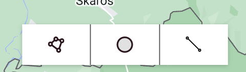
First of all, let's add the Drawing Buttons that will be displayed at the bottom of the map and activate our drawing modes - either Polygon, Polyline or Circle. Please, create a DrawingButtonsGroup.tsx file inside our routes/home directory:
import React from "react";import CircleIcon from "images/svg/circle.inline.svg";import LineIcon from "images/svg/line.inline.svg";import PolygonIcon from "images/svg/polygon.inline.svg";import { rem } from "polished";import styled from "styled-components";import { SpaceProps } from "styled-system";import { BoxShadow, Color } from "Theme";import { Box, Flex } from "components/Layout";
export enum ButtonName {  Line = "line",  Circle = "circle",  Polygon = "polygon",}
type SelectedValue = ButtonName | null;
interface ButtonProps {  onClick: () => void;  name: ButtonName;  selectedValue?: SelectedValue;}
interface GroupProps extends SpaceProps {  selectedValue: SelectedValue;  children: React.ReactElement<ButtonProps>[] | React.ReactElement<ButtonProps>;}
const BUTTONS_HEIGHT = rem(40);const BUTTONS_WIDTH = rem(200);
const getIconCompByName = (name: ButtonName) => {  switch (name) {    case ButtonName.Line:      return <LineIcon />;    case ButtonName.Circle:      return <CircleIcon />;    case ButtonName.Polygon:      return <PolygonIcon />;
    default:      return <Box />;  }};
const Container = styled(Flex)`  width: ${BUTTONS_WIDTH};  height: ${BUTTONS_HEIGHT};
  box-shadow: ${BoxShadow.Small};  background-color: ${Color.White};
  div:not(:last-child) {    border-right: 1px solid ${Color.BlackOak};  }`;
function DrawingButton({ onClick, selectedValue, name }: ButtonProps) {  return (    <Flex      onClick={onClick}      flex={1}      alignItems="center"      justifyContent="center"      bg={selectedValue === name ? Color.BleachedSilk : Color.White}    >      {getIconCompByName(name)}    </Flex>  );}
export function DrawingButtonsGroup({  children,  selectedValue,  ...props}: GroupProps) {  return (    <Container {...props}>      {React.Children.map(children, (child) =>        React.cloneElement(child, {          selectedValue,        })      )}    </Container>  );}
DrawingButtonsGroup.Button = DrawingButton;
export const useDrawingButtons = () => {  const [buttonName, setButtonName] = React.useState<ButtonName | null>(null);
  const resetButtonName = () => {    setButtonName(null);  };
  return { buttonName, setButtonName, resetButtonName };};
As you can see above, we have created a group of buttons that we export along with their custom hook useDrawingButtons. Each of the 3 buttons is assigned a value from the ButtonName enum that is passed as a name prop and accepts the selectedValue that can be either ButtonName or undefined | null. If the name equals the selectedValue, the button background color gets changed, meaning the button is pressed. And, of course, our useDrawingButtons hook helps manipulate the above-mentioned actions by setting and storing the selected button name.

Polygon card
Now let's create in the same directory a PolygonCard folder where we will create the ColorButtonsGroup.tsx file:
import React from "react";import { rem } from "polished";import { SpaceProps } from "styled-system";import { Color, Radius } from "Theme";import { Flex } from "components/Layout";import { Container } from "./Container";
export enum ButtonColor {  Blue = "blue",  LightBlue = "lightBlue",  Pink = "pink",  Red = "red",  Green = "green",}
export const NamesToColors = {  [ButtonColor.Blue]: Color.OlympicBlue,  [ButtonColor.LightBlue]: Color.PicnicDaySky,  [ButtonColor.Pink]: Color.FugitiveFlamingo,  [ButtonColor.Red]: Color.GlowingBrakeDisc,  [ButtonColor.Green]: Color.PeppermintToad,};
type SelectedValue = ButtonColor | null;
interface ButtonProps {  color: ButtonColor;  selectedValue?: SelectedValue;  onClick: (value: ButtonColor) => void;}
interface GroupProps extends SpaceProps {  selectedValue: SelectedValue;  children: React.ReactElement<ButtonProps>[] | React.ReactElement<ButtonProps>;}
const BUTTON_SIZE = rem(24);
function ColorButton({ onClick, selectedValue, color }: ButtonProps) {  return (    <Flex      as="button"      onClick={() => onClick(color)}      alignItems="center"      justifyContent="center"      width={BUTTON_SIZE}      height={BUTTON_SIZE}      borderRadius={Radius.Circle}      bg={NamesToColors[color]}      border={        selectedValue === color ? `3px solid ${Color.BlackOak}` : undefined      }    />  );}
export function ColorButtonsGroup({  children,  selectedValue,  ...props}: GroupProps) {  return (    <Container {...props}>      {React.Children.map(children, (child) =>        React.cloneElement(child, {          selectedValue,        })      )}    </Container>  );}
ColorButtonsGroup.Button = ColorButton;
This is also a group of buttons that has a structure similar to the DrawingButtonsGroup component. These buttons will help us select both the border and background colors of the Polygon shape we will implement further in the article. The important part here is that we declare the ButtonColor enum, meaning we will have 5 possible colors.
Let's create another group of buttons in the same folder: BorderButtonsGroup.tsx:
import React from "react";import { rem } from "polished";import { SpaceProps } from "styled-system";import { Color, Radius } from "Theme";import { Flex } from "components/Layout";import { Text } from "components/Typography";import { Container } from "./Container";
export enum BorderWidth {  ExtraSmall = 1,  Small,  Medium,  Large,  ExtraLarge,}
interface ButtonProps {  borderWidth: BorderWidth;  selectedValue?: BorderWidth | null;  onClick: (value: BorderWidth) => void;}
interface GroupProps extends SpaceProps {  selectedValue: number | null;  children: React.ReactElement<ButtonProps>[] | React.ReactElement<ButtonProps>;}
const BUTTON_SIZE = rem(32);
function ColorButton({ onClick, selectedValue, borderWidth }: ButtonProps) {  return (    <Flex      as="button"      onClick={() => onClick(borderWidth)}      alignItems="center"      justifyContent="center"      width={BUTTON_SIZE}      height={BUTTON_SIZE}      borderRadius={Radius.Circle}      border={`1px solid ${Color.BleachedSilk}`}      bg={selectedValue === borderWidth ? Color.BleachedSilk : Color.White}    >      <Text color={Color.GreekFlagBlue}>{`${borderWidth}px`}</Text>    </Flex>  );}
export function BorderButtonsGroup({  children,  selectedValue,  ...props}: GroupProps) {  return (    <Container {...props}>      {React.Children.map(children, (child) =>        React.cloneElement(child, {          selectedValue,        })      )}    </Container>  );}
BorderButtonsGroup.Button = ColorButton;
This is the exact group of buttons that have some minor differences in the CSS. This component also introduces another enum - BorderWidth, that will also be used inside our Map component.
Both ColorButtonsGroup and BorderButtonsGroup share the same Container component; let's add it inside the same folder:
import styled from "styled-components";import { Space } from "Theme";import { Flex } from "components/Layout";
export const Container = styled(Flex)`  align-items: center;
  button:not(:last-child) {    margin-right: ${Space.S};  }`;
It is now time to add the polygon card component itself and use there the button groups declared above. Please add this code to the PolygonCard.tsx file in the same folder:
import React from "react";import TrashIcon from "images/svg/trash.inline.svg";import { rem } from "polished";import styled from "styled-components";import { Color, CustomSpace, FontSize, FontWeight, Space } from "Theme";import { Box, Flex } from "components/Layout";import { Text } from "components/Typography";import { BorderButtonsGroup, BorderWidth } from "./BorderButtonsGroup";import { ButtonColor, ColorButtonsGroup } from "./ColorButtonsGroup";
type Props = { area: number | string, selectedBorderWidth: BorderWidth, selectedBorderColor: ButtonColor, selectedBackgroundColor: ButtonColor, onDelete: () => void, onChangeBorderWidth: (value: BorderWidth) => void, onChangeBorderColor: (value: ButtonColor) => void, onChangeBackgroundColor: (value: ButtonColor) => void,};
export const POLYGON_CARD_SIZE = 300;const LEFT_OFFSET = Space.M;
const Title = styled(Text).attrs({ as: "p" })` font-size: ${FontSize.L}; font-weight: ${FontWeight.Normal}; margin: ${CustomSpace[12]} 0 ${CustomSpace[12]} ${LEFT_OFFSET};`;
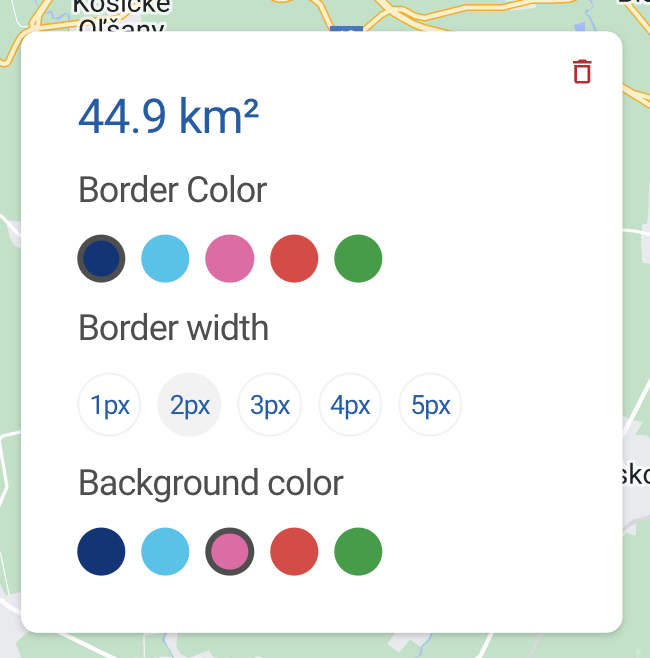
export function PolygonCard({ area, onDelete, onChangeBorderColor, onChangeBorderWidth, onChangeBackgroundColor, selectedBorderColor, selectedBorderWidth, selectedBackgroundColor,}: Props) { return ( <Box width={rem(POLYGON_CARD_SIZE)} height={rem(POLYGON_CARD_SIZE)} bg={Color.White} p={CustomSpace[12]} > <Flex alignItems="center" justifyContent="flex-end"> <TrashIcon onClick={onDelete} cursor="pointer" /> </Flex>
<Text fontSize={FontSize.XXL} fontWeight={FontWeight.Normal} color={Color.GreekFlagBlue} mt={Space.S} ml={LEFT_OFFSET} > {area} </Text>
<Title>Border Color</Title>
<ColorButtonsGroup selectedValue={selectedBorderColor} ml={LEFT_OFFSET}> {[ ButtonColor.Blue, ButtonColor.LightBlue, ButtonColor.Pink, ButtonColor.Red, ButtonColor.Green, ].map((color) => ( <ColorButtonsGroup.Button key={color} color={color} onClick={onChangeBorderColor} /> ))} </ColorButtonsGroup>
<Title>Border width</Title>
<BorderButtonsGroup selectedValue={selectedBorderWidth} ml={LEFT_OFFSET}> {[ BorderWidth.ExtraSmall, BorderWidth.Small, BorderWidth.Medium, BorderWidth.Large, BorderWidth.ExtraLarge, ].map((borderWidth) => ( <BorderButtonsGroup.Button key={borderWidth} borderWidth={borderWidth} onClick={onChangeBorderWidth} /> ))} </BorderButtonsGroup>
<Title>Background color</Title>
<ColorButtonsGroup selectedValue={selectedBackgroundColor} ml={LEFT_OFFSET} > {[ ButtonColor.Blue, ButtonColor.LightBlue, ButtonColor.Pink, ButtonColor.Red, ButtonColor.Green, ].map((color) => ( <ColorButtonsGroup.Button key={color} color={color} onClick={onChangeBackgroundColor} /> ))} </ColorButtonsGroup> </Box> );}If you look at the PolygonCard component, you can see that it has the following props:
areaof the polygon that will be calculated in one of our utils later.onDeleteremoves our polygon from the map.selectedBorderColor,selectedBorderWidth,selectedBackgroundColorinform our button groups about what button is currently selected.onChangeBorderColor,onChangeBorderWidth,onChangeBackgroundColorperform the similarly named actions on clicking the above - mentioned buttons.
And, of course, let's export all the components by creating the index.ts file in the same folder:
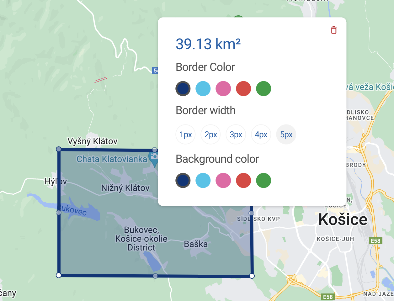
export * from "./BorderButtonsGroup";export * from "./ColorButtonsGroup";export * from "./PolygonCard";Our newly created Polygon card will now look like this:

Undo button
Now let's create the UndoButton.tsx file inside the routes/home directory:
import React from "react";import UndoIcon from "images/svg/undo.inline.svg";import { rem } from "polished";import { Color } from "Theme";import { Flex } from "components/Layout";
type Props = {  onClick: () => void,};
const BUTTON_SIZE = rem(40);
export function UndoButton({ onClick }: Props) {  return (    <Flex      onClick={onClick}      alignItems="center"      justifyContent="center"      width={BUTTON_SIZE}      height={BUTTON_SIZE}      bg={Color.White}    >      <UndoIcon cursor="pointer" />    </Flex>  );}
This button will appear every time we drag either the vertex or the edge of our future polygons; clicking on it will undo the changes to the polygon shape. This is how the button will look:

Adding map constants and config
Now it's time to add some crucial constants that we need to use in the config of our map. Should you need to refresh your memory or learn more about the MapConfig, you can go to the Setting data, constants, and making first steps section in my React Google Maps article and dive into their detailed description. Let's just briefly mention that in our MapConfigOptions I disabled all the default map elements that we don't need in our project and set the gestureHandling to greedy in order to navigate our map with more ease and without having to use both fingers or CTRL. You can learn more about gesture handling here.
import { Color } from "Theme";import { POLYGON_CARD_SIZE } from "./PolygonCard";
const NATIVE_TRIANGLE_SIZE = 12;const POLYGON_CARD_RIGHT_OFFSET = 20;
const PlusSymbol = {  path: "M0,-1 V1 M-1,0 H1",  strokeOpacity: 1,  scale: 3,};
const MapConfigOptions: google.maps.MapOptions = {  zoomControl: false,  mapTypeControl: false,  disableDefaultUI: true,  fullscreenControl: false,  streetViewControl: false,  gestureHandling: "greedy",};
const MapConfig = {  zoom: 12,  center: { lat: 48.716385, lng: 21.261074 },  options: MapConfigOptions,  mapContainerStyle: {    width: "100vw",    height: "100vh",  },};
const PolygonOptions = {  strokeWeight: 5,  fillOpacity: 0.3,  fillColor: Color.OlympicBlue,  strokeColor: Color.OlympicBlue,  suppressUndo: true,};
const PolylineOptions = {  strokeWeight: 5,  fillOpacity: 0.3,  strokeColor: Color.OlympicBlue,  suppressUndo: true,  icons: [    {      icon: PlusSymbol,      repeat: "22px",    },  ],};
export const MapSettings = {  MapConfig,  PolygonOptions,  PolylineOptions,  CircleOptions: PolygonOptions,  InfoWindowOptions: {    Triangle: {      width: 13,      height: 8,    },    PixelOffset: { X: 0, Y: -5 },    Polygon: {      UndoPixelOffset: { X: 0, Y: -5 },      CardPixelOffset: {        X: POLYGON_CARD_SIZE / 2 + POLYGON_CARD_RIGHT_OFFSET,        Y: (POLYGON_CARD_SIZE + NATIVE_TRIANGLE_SIZE) / 2,      },    },  },};
Except for the MapConfig we have added a number of other parameters to the MapSettings object. These parameters represent a config for our drawing tools:
We set all the options for our future polygons, polylines, and circles (you may notice that circles and polygons have identical properties). As a footnote,
PolylineOptionshave theiconskey - this is where we add our custom SVG symbol and repeat it along the length of the polyline to achieve the ruler shape.we set the
InfoWindowOptions; here we primarily define all the necessary offsets for all the cards (cards will be displayed inside the native InfoWindow module ) and shapes we will have in our map.
Adding Map and Drawing Manager
Now it's finally time to add our basic Map component - let's add it to the routes/home directory:
import React, { forwardRef, useImperativeHandle } from "react";import {  Circle,  DrawingManager,  GoogleMap,  GoogleMapProps,  InfoWindow,  Polygon,  Polyline,} from "@react-google-maps/api";import styled from "styled-components";import { BoxShadow } from "Theme";import { Box } from "components/Layout";import { MapSettings } from "./constants";
export type MapRef = {  drawCircle: () => void;  drawPolygon: () => void;  drawPolyline: () => void;};
interface MapProps extends GoogleMapProps {  resetDrawingButtons?: () => void;}
const {  MapConfig,  CircleOptions,  PolygonOptions,  PolylineOptions,  InfoWindowOptions,} = MapSettings;
const MapStyles = styled(Box)`  .gm-ui-hover-effect {    display: none !important;  }  .gm-style .gm-style-iw-tc {    display: none;  }  .gm-style .gm-style-iw-tc::after {    width: ${InfoWindowOptions.Triangle.width}px;    height: ${InfoWindowOptions.Triangle.height}px;    transform: translateX(50%);  }  .gm-style-iw.gm-style-iw-c {    box-shadow: ${BoxShadow.Small};    padding: 0;
    .gm-style-iw-d {      overflow: hidden !important;    }  }`;
export const Map = forwardRef<MapRef, MapProps>(  ({ children, resetDrawingButtons, ...rest }, ref) => {    const drawingRef = React.useRef<DrawingManager | null>(null);
    useImperativeHandle(ref, () => ({      drawPolygon: () => {        if (drawingRef.current) {          drawingRef.current?.state.drawingManager?.setDrawingMode(            google.maps.drawing.OverlayType.POLYGON          );        }      },      drawCircle: () => {        if (drawingRef.current) {          drawingRef.current?.state.drawingManager?.setDrawingMode(            google.maps.drawing.OverlayType.CIRCLE          );        }      },      drawPolyline: () => {        if (drawingRef.current) {          drawingRef.current?.state.drawingManager?.setDrawingMode(            google.maps.drawing.OverlayType.POLYLINE          );        }      },    }));
    return (      <MapStyles>        <GoogleMap {...MapConfig} {...rest}>          <DrawingManager            ref={drawingRef}            options={{              drawingControl: false,              circleOptions: CircleOptions,              polygonOptions: PolygonOptions,              polylineOptions: PolylineOptions,            }}          />
          {children}        </GoogleMap>      </MapStyles>    );  });
So, first of all, this code already enables you to create all the shapes via Drawing Manager. The only problem here is that you won't have any control over the resulting drawings - you won't be able to trigger any events (opening InfoWindows on click, etc.) or change their properties, like a border or fill color, and their coordinates will be hidden from you, meaning you can't pass them to your locale storage or database. And this is precisely what this article is about.
Now, let's have a closer look at the code. You probably noticed that we rewrite some of the native CSS styles in MapStyles - you can learn more about that in the Changing native CSS rules section of my first article. We also declare the drawingRef in order to get access to the state and native methods of the DrawingManager - these are used inside the useImperativeHandle where we declare our 3 drawing functions: drawPolygon, drawCircle, drawPolyline. From now on, we can pass the ref to the Map component and use these methods from the outside. This is how we can now pass our Drawing buttons as children to the Map component and assign each button the respective method.
We also pass our MapConfig to the GoogleMap module and set the default options for our shapes in the DrawingManager. We also set the drawingControl to false in order to hide the default drawing buttons and create our own.
Adding Home page and building the App
Now, let's create the Home.tsx file inside the same directory: routes/home. It will actually create our home page and allow us to build the App. Please, don't forget to import this page from the src/pages directory inside the index.ts file - this is how Gatsby works. If you have some problems with the project structure, you can have a look at the finished version of the project on my Github page.
import React from "react";import { Libraries, LoadScript } from "@react-google-maps/api";import { rem } from "polished";import styled from "styled-components";import { GenericPage } from "components/GenericPage";import {  ButtonName,  DrawingButtonsGroup,  useDrawingButtons,} from "./DrawingButtonsGroup";import { Map, MapRef } from "./Map";
const MAP_BUTTONS_OFFSET_Y = rem(10);
const LIBRARIES: Libraries = ["drawing", "geometry"];
const ButtonsContainer = styled("div")`  position: absolute;  left: 50%;  bottom: ${MAP_BUTTONS_OFFSET_Y};
  transform: translateX(-50%);`;
function Home() {  const mapRef = React.useRef < MapRef > null;  const { buttonName, setButtonName, resetButtonName } = useDrawingButtons();
  return (    <GenericPage>      <LoadScript        googleMapsApiKey={process.env.GATSBY_GOOGLE_KEY ?? ""}        libraries={LIBRARIES}      >        <Map ref={mapRef} resetDrawingButtons={resetButtonName}>          <ButtonsContainer>            <DrawingButtonsGroup selectedValue={buttonName}>              <DrawingButtonsGroup.Button                name={ButtonName.Polygon}                onClick={() => {                  mapRef.current?.drawPolygon();                  setButtonName(ButtonName.Polygon);                }}              />              <DrawingButtonsGroup.Button                name={ButtonName.Circle}                onClick={() => {                  mapRef.current?.drawCircle();                  setButtonName(ButtonName.Circle);                }}              />              <DrawingButtonsGroup.Button                name={ButtonName.Line}                onClick={() => {                  mapRef.current?.drawPolyline();                  setButtonName(ButtonName.Line);                }}              />            </DrawingButtonsGroup>          </ButtonsContainer>        </Map>      </LoadScript>    </GenericPage>  );}
export default Home;
Here, I would like to draw your attention to the LoadScript module that we import from @react-google-maps/api. We must pass it our Map component as children along with 2 parameters: googleMapsApiKey and libraries. Please, pass the API key you were supposed to create at the beginning of the article - this key is sensitive, and thus I used .env to keep it secret. As I also mentioned, we will need to activate 2 libraries: drawing and geometry, and we do that by declaring the LIBRARIES array and passing it to the LoadScript module. And this is where we finally use our Libraries type that we patched with patch-package.
Evidently, we also pass our DrawingButtonsGroup that actually represents the control buttons, and each button is assigned its respective drawing method that we get via mapRef.
Using Drawing Manager to create controlled polygons
So, as we have already stated, the current implementation doesn't allow us to take control over the shapes created via DrawingManager. What actually happens is that DrawingManager works as a black box that we don't have very much access to. That means we should use DrawingManager for the drawing capabilities only and then display our shape by means of the corresponding shape module (Polygon, Polyline, Circle) that we can pass to the GoogleMap as children.
Let's first create a mapTypes.ts file in the routes/home directory. Here we will store the declarations of all our map related types. Please pass the following code there:
import { BorderWidth, ButtonColor } from "./PolygonCard";
export interface PolygonOptionsType {  borderWidth: BorderWidth;  borderColor: ButtonColor;  backgroundColor: ButtonColor;}
export interface PolygonType {  id: number;  coordinates: google.maps.LatLngLiteral[];  prevCoordinates: google.maps.LatLngLiteral[] | [];  polygonInstance: google.maps.Polygon | null;  options: PolygonOptionsType;}
Let's create a utils folder in the routes/home directory and pass our first util there in the file coordinateFuncsToCoordinates.ts:
export const coordinateFuncsToCoordinates = ( coordinates: google.maps.LatLng[]) => coordinates.map(({ lat, lng }) => ({ lat: lat(), lng: lng(), }));We will use this function quite frequently; it will help us convert the native Google Maps coordinates type - an array of objects containing coordinate functions to an array of objects containing real coordinates instead. It is a lot more convenient to operate this data format, and, in addition, you can then store this data either in your local storage or database (you can't store functions because you will lose their context).
Then let's add this line to the map component:
const [polygons, setPolygons] = React.useState<MT.PolygonType[]>([]);So, polygons is the React state where we keep the data of all the polygons we create. Each polygon will be assigned its id so that we can find it in the polygons array. It will also have coordinates - current coordinates of the polygon, whose position on the map is based on, prevCoordinates - these will be used to implement the undo functionality, polygonInstance - the instance of the newly created polygon that will enable us to change polygon options (fill color, border width, etc.) via the PolygonCard component, and options - current options assigned to the polygon.
Then we should add the resetDrawingToolsMode method to our Map component. It resets the drawing mode selected to draw a certain shape - we will use it once the shape drawing is finished. We use the drawingManager ref here:
const resetDrawingToolsMode = () => { drawingRef.current?.state.drawingManager?.setDrawingMode(null);};Let's create in the Map.tsx file the default polygon options that will be assigned to the newly created polygon and thus passed to the polygons React state:
import { BorderWidth, ButtonColor } from "./PolygonCard";
export const DefaultPolygonOptions = {  borderColor: ButtonColor.Blue,  backgroundColor: ButtonColor.Blue,  borderWidth: BorderWidth.ExtraLarge,};
Now, let's import all the types along with the Ramda library that you should install. For more information, click here.
import * as R from "ramda";import * as MT from "./mapTypes";Then, please add the following event handler to the DrawingManager module:
onOverlayComplete={(evt) => {  const { type, overlay } = evt;
  if (overlay) {    window.google.maps.event.clearInstanceListeners(overlay);    overlay.setMap(null);    resetDrawingButtons?.();
    if (type === google.maps.drawing.OverlayType.POLYGON) {      const typedOverlay = overlay as google.maps.Polygon;      const coordinateFuncs: google.maps.LatLng[] = typedOverlay        .getPath()        .getArray();
      const coordinates =        coordinateFuncsToCoordinates(coordinateFuncs);
      if (coordinates.length < POLYGON_NODES_MIN_QUANTITY) {        return;      }
      setPolygons((prevPolygons) => [        ...prevPolygons,        {          id: R.inc(polygons.length),          coordinates,          options: DefaultPolygonOptions,          prevCoordinates: [],          polygonInstance: null,        },      ]);
      resetDrawingToolsMode();    }  }}}
The DrawingManager has the onOverlayComplete event that returns us the type of the shape (Polygon, Circle, Polyline) we have just finished drawing and its instance that is called overlay. The main idea behind using this event and its props is that we need to create our polygon, save its coordinates to the polygons state, and then remove this uncontrolled polygon that we have no access to. This is exactly what happens in the clearInstanceListeners(overlay) and overlay.setMap(null). Then we call the resetDrawingButtons passed as props to the Map component in order to disable the drawing button that was pressed to activate the proper drawing mode.
As you can see, we then check the type of our shape to make sure it's a polygon (we will add the logic for Circles and Polylines later). Then we extract coordinateFuncs from the overlay and get the polygon coordinates via our coordinateFuncsToCoordinates util. Then we have another check: we want to make sure that the newly drawn polygon has at least three nodes. Otherwise, the user will be able to draw a line or just a dot instead. That is why we proceed in the handler only if the coordinates.length is greater than POLYGON_NODES_MIN_QUANTITY. By the way, let's add this constant above our component:
const POLYGON_NODES_MIN_QUANTITY = 3;We then finally pass the default options and extracted coordinates of the newly drawn (and already removed) polygon to the setPolygons React state, while prevCoordinates are assigned an empty array (we have none at the moment) and the polygonInstance is set to null - we removed our polygon instance created by the Drawing Manager, and we will use another instance from the Polygon module when the controlled Polygon is mounted. And, finally, we assign this polygon its id by incrementing the polygon array length - R.inc(polygons.length). Please check the Ramda in the docs here. So, at this point, we have all the necessary data to render our own controlled polygon, and that is what we are going to do in the next section.
Creating controlled polygons using a Polygon module
Now we are ready to render our controlled polygon, but before doing that, let's add dropAndReturnLastElement util to the routes/home/utils directory. We will use this a number of times when dealing with the React state. It will help us drop the last element from an array and return both this lastElement and the rest of the array elements as elementsWithoutLast:
import * as R from "ramda";
export const dropAndReturnLastElement = <T>(elements: T[]): [T[], T] => {  const lastElement = R.last(elements)!;  const elementsWithoutLast = R.dropLast(1, elements);
  return [elementsWithoutLast, lastElement];};
Let's render our controlled polygons by adding this code to the Map component and passing it as children to the GoogleMap module:
{  polygons.map((polygon) => (    <Polygon      key={polygon.id}      editable      draggable      paths={polygon.coordinates}      onLoad={(polygonInstance) => {        polygonInstance.setOptions(PolygonOptions);
        setPolygons((prevPolygons) => {          const [polygonsWithoutLast, lastPolygon] =            dropAndReturnLastElement(prevPolygons);
          return [...polygonsWithoutLast, { ...lastPolygon, polygonInstance }];        });
        handleSetPolygonCardLatLng(polygon);      }}    />  ));}
Here we render our polygons based on the data extracted from the DrawingManager. We pass the coordinates from the polygon state as paths as well as set the editability and draggability of our polygons. Inside the onLoad callback, we finally get our polygonInstance that we use to set the initial PolygonOptions of the newly rendered polygon and then update the polygons state by passing it this polygonInstance that was set to null in the onOverlayComplete callback of the DrawingManager.
The last thing we need to do is open a Polygon card once a new polygon is created to show the user all the options this newly rendered polygon has, and demonstrate the actions the user can take to modify the polygon. This is what is done via the handleSetPolygonCardLatLng that is called at the very end of the onLoad callback.
So, let's implement the handleSetPolygonCardLatLng by declaring another React state in our Map component:
const [polygonCardData, setPolygonCardData] = React.useState<MT.PolygonCardType | null>(null);Let's also add the PolygonCardType to the mapTypes.ts file:
export interface PolygonCardType { id: number; lat: number; lng: number;}Please notice that polygons along with polygonCardData have all the necessary data we need to display our polygon card. The card itself will be displayed every time polygonCardData is not set to null. The data we pass to the polygonCardData is polygon id (we need it to find the right polygon in the polygons state and extract all the options), and, of course, coordinates of the point that we need to display our card over: lat, lng.
Since we would like to display the polygon card on the right of the polygon itself and properly center it, we need to create a bounding box to wrap the polygon with.

No matter how tricky and complex the shape of our polygon is, we can easily create a box around it and place the card on the right-hand side in relation to the bounding box center. Let's declare the handleSetPolygonCardLatLng inside the map component:
const handleSetPolygonCardLatLng = (polygon: MT.PolygonType) => {  const bounds = new window.google.maps.LatLngBounds();
  polygon.coordinates.forEach(({ lat, lng }) =>    bounds.extend(new window.google.maps.LatLng(lat, lng))  );
  const polygonBoundingBoxCenter = bounds.getCenter();  const polygonBoundingBoxCenterNorthEast = bounds.getNorthEast();
  setPolygonCardData({    id: polygon.id,    lat: polygonBoundingBoxCenter.lat(),    lng: polygonBoundingBoxCenterNorthEast.lng(),  });};
Our function above receives a polygon element from the polygons React state and thus has access to its coordinates - they are used to create the bounding box around our polygon via the bounds.extend method. Once the bounding box is ready, we need to get the coordinates of the point where we will display our card. In other words, we need the latitude of the box center (bounds.getCenter) and the longitude of the box's right corner (bounds.getNorthEast). We pass these coordinates to the setPolygonCardData state along with the polygon id.
Adding Polygon Card
We will display our Polygon Card with the help of the InfoWindow module. We will also need to improve our user experience by closing InfoWindows via outside click functionality. It would also be great not to close them when dragging the map. Let's install a library called react-outside-click-handler. You can do that by typing in your terminal inside the project folder: npm i react-outside-click-handler.
We also need to declare another useState:
const [isClickOutsideDisabled, setIsClickOutsideDisabled] = React.useState(false);And finally let's pass onDragStart and onDragEnd to our GoogleMap module:
<GoogleMap ref={mapRef} // Just added onDragStart={() => { setIsClickOutsideDisabled(true); }} onDragEnd={() => { setIsClickOutsideDisabled(false); }} {...MapConfig} {...rest} >Before adding the InfoWindow component that wraps the PolygonCard, we need to create all the necessary utils and handlers. As you may remember, our PolygonCard needs to know what properties (border width, color, etc.) the specific polygon has, and requires some methods that will be able to change all these properties.
The first handler we will create is handleChangePolygonOptions. Please create a new file dropAndReturnElementById.ts in the routes/home/utils directory:
interface Id {  id: number;}
interface Props<T> {  id: number;  elements: T[];}
export const dropAndReturnElementById = <T extends Id>({  id,  elements,}: Props<T>): [T[], T] => {  const currentElement = elements.find(    ({ id: elementId }: { id: number }) => elementId === id  )!;
  const elementsWithoutCurrent = elements.filter(    ({ id: elementId }: { id: number }) => id !== elementId  );
  return [elementsWithoutCurrent, currentElement];};
This util will be used a number of times around the project when updating React state by dropping a certain element found by id and adding it back to an array of elements it was dropped from.
Now, let's add our handler:
const handleChangePolygonOptions = ({  id,  options,  polygonOption,}: MT.ChangePolygonOptions) => {  const [polygonsWithoutCurrent, currentPolygon] = dropAndReturnElementById({    id,    elements: polygons,  });
  currentPolygon.polygonInstance?.setOptions(options);
  const updatedPolygons = R.append(    {      ...currentPolygon,      options: {        ...currentPolygon.options,        ...polygonOption,      },    },    polygonsWithoutCurrent  );
  setPolygons(updatedPolygons);};
We also need to add the ChangePolygonOptions to the mapTypes.ts file:
export interface ChangePolygonOptions { id: number; options: google.maps.PolygonOptions; polygonOption: { [key: string]: BorderWidth | ButtonColor };}Our handler expects a polygon id so that we could use dropAndReturnElementById, options - actual option (strokeColor, fillColor, etc.) that we need to change using the polygon instance, and polygonOption that helps us update our polygons React state. In other words, this function updates 1 of the 3 options of our polygons and does it in 2 places: the polygon instance gotten from the Polygon module in the onLoad callback and the polygons state that is used to render our polygons, which works as a source of truth for the polygon properties.
Let's add our next util as a getPolygonOptionByName.ts file:
import { PolygonOptionsType, PolygonType } from "../mapTypes";import { dropAndReturnElementById } from "./dropAndReturnElementById";
interface Props {  polygonId: number;  polygons: PolygonType[];  name: keyof PolygonOptionsType;}
export const getPolygonOptionByName = ({  name,  polygons,  polygonId,}: Props) => {  const [, currentPolygon] = dropAndReturnElementById({    id: polygonId,    elements: polygons,  });
  return currentPolygon.options[name];};
This util will help us pass our PolygonCard the actual property values assigned to the selected polygon: each polygon should know what value is chosen for a particular property (border width, fill color, etc.). This util accepts the name of a certain property, finds the necessary element from the polygons via polygonId, and extracts the property value by the name.
Our PolygonCard component also expects the area param and thus we need a calculatePolygonArea util:
import { PolygonType } from "../mapTypes";
export const calculatePolygonArea = ({  polygons,  polygonId,}: {  polygonId: number,  polygons: PolygonType[],}) => {  const fallBackValue = 0;  const maxValueInSquareMeters = 10000;  const squareMetersToSquareKilometersRatio = 10 ** -6;
  const { coordinates } = polygons.find(({ id }) => id === polygonId) ?? {};
  if (coordinates) {    const squareMeters =      google.maps.geometry.spherical.computeArea(coordinates);
    const isValueDisplayedInSquareMeters =      squareMeters <= maxValueInSquareMeters;
    const area = parseFloat(      (isValueDisplayedInSquareMeters        ? squareMeters        : squareMeters * squareMetersToSquareKilometersRatio      ).toFixed(2)    );
    return isValueDisplayedInSquareMeters ? `${area} m²` : `${area} km²`;  }
  return `${fallBackValue} m²`;};
Polygon area is calculated in square meters by the computeArea method from google.maps.geometry.spherical that accepts polygon coordinates (we find them from polygons by polygonId). Our util returns the area value in square meters if it is no more than 10000, otherwise, it converts the value to square kilometers.
Now, let's pass this component as children to the GoogleMap module:
{polygonCardData && (  <InfoWindow    position={{      lat: polygonCardData.lat,      lng: polygonCardData.lng,    }}    options={{      pixelOffset: new window.google.maps.Size(        InfoWindowOptions.Polygon.CardPixelOffset.X,        InfoWindowOptions.Polygon.CardPixelOffset.Y      ),    }}  >    <OutsideClickHandler      onOutsideClick={() => {        setPolygonCardData(null);      }}      disabled={isClickOutsideDisabled}    >      <PolygonCard        area={calculatePolygonArea({          polygons,          polygonId: polygonCardData.id,        })}        selectedBackgroundColor={          getPolygonOptionByName({            polygons,            name: "backgroundColor",            polygonId: polygonCardData.id,          }) as ButtonColor        }        selectedBorderColor={          getPolygonOptionByName({            polygons,            name: "borderColor",            polygonId: polygonCardData.id,          }) as ButtonColor        }        selectedBorderWidth={          getPolygonOptionByName({            polygons,            name: "borderWidth",            polygonId: polygonCardData.id,          }) as BorderWidth        }        onChangeBorderColor={(color: ButtonColor) => {          handleChangePolygonOptions({            id: polygonCardData.id,            polygonOption: { borderColor: color },            options: { strokeColor: NamesToColors[color] },          });        }}        onChangeBackgroundColor={(color: ButtonColor) => {          handleChangePolygonOptions({            id: polygonCardData.id,            polygonOption: { backgroundColor: color },            options: { fillColor: NamesToColors[color] },          });        }}        onChangeBorderWidth={(borderWidth: BorderWidth) => {          handleChangePolygonOptions({            id: polygonCardData.id,            polygonOption: { borderWidth },            options: { strokeWeight: borderWidth },          });        }}        onDelete={() => {          const [polygonsWithoutCurrent] = dropAndReturnElementById({            id: polygonCardData.id,            elements: polygons,          });
          setPolygons(polygonsWithoutCurrent);
          setPolygonCardData(null);        }}      />    </OutsideClickHandler>  </InfoWindow>)}
Here, we should take a closer look at what is going on in the code snippet above. First of all, we display our Polygon card conditionally - only when the polygonCardData is not set to null. Our PolygonCard has 2 wrappers: InfoWindow (a native Google Maps module that represents a window on the map and requires coordinates and some other options such as vertical and horizontal offsets), and OutsideClickHandler, which helps us close the polygon card if the user clicks outside the card boundaries. We also disable the OutsideClickHandler by passing it disabled={isClickOutsideDisabled} when map dragging events are triggered.
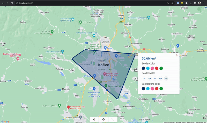
If you comment out options in the InfoWindow module, build the app and draw a rectangle, you will see the following result:

You can see that the InfoWindow is displayed over the dot that has the coordinates of the bounding box right side center. We achieved this in the handleSetPolygonCardLatLng mentioned above. But our goal was to display the InfoWindow a bit differently - on the right of the bounding box with a particular right offset and center the card vertically. This can be easily achieved by passing the proper offset X and Y options to the InfoWindow module. If you go to our constants.ts file, you will see that their values look the following way:
CardPixelOffset: { X: POLYGON_CARD_SIZE / 2 + POLYGON_CARD_RIGHT_OFFSET, Y: (POLYGON_CARD_SIZE + NATIVE_TRIANGLE_SIZE) / 2,},To fix the X axis, we move the card to the right by 50% and add a small right offset so that it does not intersect the bounding box/polygon, and the Y axis is also amended by moving the card by 50% to the bottom, including the size of the native triangle (we removed it by rewriting native CSS, but the offset remains anyway and is approximately 12px). Now if you rebuild the app and draw a rectangle again, the card position will be correct:

You can also see that the PolygonCard has an onDelete param - this functionality is achieved by removing the polygon element from the polygons React state and setting the card data to null.
At this point, we have finally created our controlled polygons with a proper card displaying their area and properties. You can build the app and try to change polygon properties by selecting them via the card buttons. Since our polygons are controlled (we render them based on values in React state), we know exactly what coordinates and properties they have and can subsequently use them in our database. Now we need to implement dragging, shape-changing, and undo functionality - this is what we are going to focus on in the next chapter.
Polygon dragging
The main idea behind polygon dragging is updating polygons React state, or, more precisely, the coordinates of the polygon you are interacting with at the end of the drag action. Polygon module has both onDragStart and onDragEnd events. We will disable the polygon card once dragging is initiated:
onDragStart={() => { setPolygonCardData(null);}}At the end of the dragging action, we need to update both previous and current coordinates and open our polygon card:
onDragEnd={() => {  const { polygonInstance } = polygon;
  if (polygonInstance) {    const coordinateFuncs: google.maps.LatLng[] = polygonInstance      .getPath()      .getArray();
    const coordinates =      coordinateFuncsToCoordinates(coordinateFuncs);
    setPolygons((prevPolygons) => {      const [polygonsWithoutCurrent] = dropAndReturnElementById({        id: polygon.id,        elements: prevPolygons,      });
      const draggedPolygon = {        ...polygon,        coordinates,        prevCoordinates: [],      };
      handleSetPolygonCardLatLng(draggedPolygon);
      return R.append(draggedPolygon, polygonsWithoutCurrent);    });  }}}
In the code snippet above, we extract the new coordinates from the polygonInstance changed after dragging and then update the polygons React state. Please, keep in mind that we should always set prevCoordinates to an empty array. This is due to the fact that we will implement the undo action only for changing our polygon's shape (replication of the native polygon behavior). And, finally, we need to use the handleSetPolygonCardLatLng to open the polygon card.
Changing polygon shape and implementing undo functionality
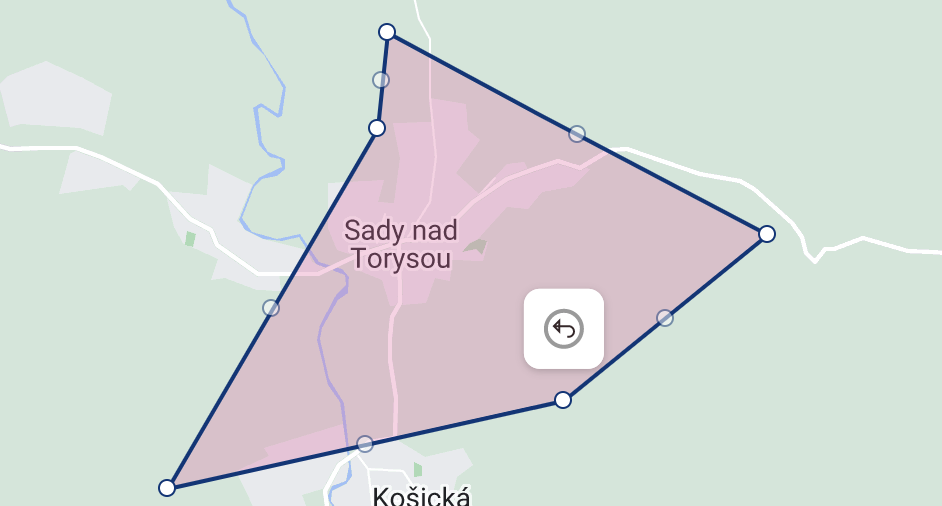
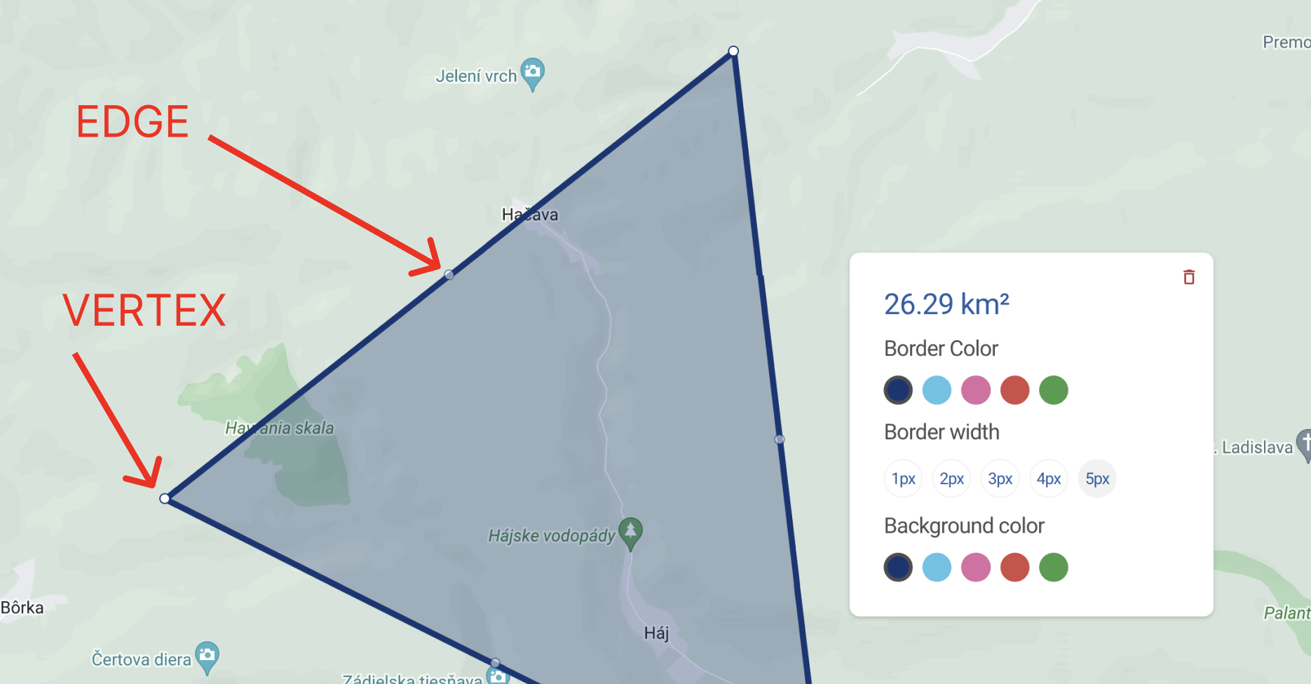
It is worth mentioning that a polygon's shape can be modified in 2 different ways: by dragging either a vertex or an edge. This is where our patched vertex and edge types will come in handy. Edges and vertices are displayed automatically if you pass editable to your Polygon module:

Unfortunately, the Polygon module doesn't have either onVertexClick or onEdgeClick events, which means we will have to make use of the onMouseUp event and come up with a way to differentiate between the click types. It turns out, that when you interact with one of the vertices, the MapMouseEvent returns the coordinates of the vertex you interacted with, even if no changes were made. So, we can use these coordinates and compare them to the polygon's coordinates to find out whether there are any differences between them, and if yes, display our undo button over the point whose coordinates got changed. But when it comes to interacting with the polygon's edges, we have to apply another approach. If you drag an edge, it finally becomes another vertex of the polygon and thus creates 2 new edges placed on its respective sides. Unfortunately, in this case, the MapMouseEvent does not return the coordinates of this edge that was transformed into a vertex; on the contrary, it returns the coordinates of one of the 2 newly created edges, and this won't help us since we always want to display our undo button over the edge or vertex we interacted with.
The simplest solution would be to compare our polygon's coordinates with the ones extracted from the polygonInstance after the interaction with either an edge or a vertex is finished. Let's create a processOnVertexOrEdgeClick util:
interface VertexWithChangedCoordinatesProps {  prevCoordinates: google.maps.LatLngLiteral[];  currentCoordinates: google.maps.LatLngLiteral[];}
const getVertexWithChangedCoordinates = ({  prevCoordinates,  currentCoordinates,}: VertexWithChangedCoordinatesProps) =>  currentCoordinates.find(    ({ lat: prevLat, lng: prevLng }) =>      !prevCoordinates.some(        ({ lat: currLat, lng: currLng }) =>          prevLat === currLat && prevLng === currLng      )  );
interface processOnVertexOrEdgeClickProps {  event: google.maps.MapMouseEvent;  prevCoordinates: google.maps.LatLngLiteral[];  currentCoordinates: google.maps.LatLngLiteral[];}
export const processOnVertexOrEdgeClick = ({  event,  prevCoordinates,  currentCoordinates,}: processOnVertexOrEdgeClickProps) => {  const isClickedOnEdgeOrVertex =    event.edge !== undefined || event.vertex !== undefined;
  const vertexWithChangedCoordinates = isClickedOnEdgeOrVertex    ? getVertexWithChangedCoordinates({        prevCoordinates,        currentCoordinates,      })    : undefined;
  return { isClickedOnEdgeOrVertex, vertexWithChangedCoordinates };};
In getVertexWithChangedCoordinates we compare 2 arrays of polygon coordinates (prevCoordinates and currentCoordinates) and return the coordinates of the vertex that was dragged or the vertex that was an edge before dragging (in this case, the currentCoordinates array will have + 1 element). And, of course, if no changed vertex was found, we return undefined.
In processOnVertexOrEdgeClick we check if there was any interaction with either a vertex or an edge, and if yes, we use the previously discussed getVertexWithChangedCoordinates function and finally return 2 values: the isClickedOnEdgeOrVertex flag along with the vertexWithChangedCoordinates.
In order to display the undo button using the vertexWithChangedCoordinates, we need to declare the undoData React state:
const [undoData, setUndoData] = React.useState<MT.UndoDataType | null>(null);We will use the undoData state to display the UndoButton component and perform the undo action on the button click.
We also need to add the UndoDataType to the mapTypes.ts file, which will include our polygon id and vertexWithChangedCoordinates represented by latitude and longitude.
export interface UndoDataType { id: number; lat: number; lng: number;}Let's now implement our onMouseUp handler:
onMouseUp={(event) => {  const { polygonInstance } = polygon;
  if (polygonInstance) {    const coordinateFuncs: google.maps.LatLng[] = polygonInstance      .getPath()      .getArray();
    const currentCoordinates =      coordinateFuncsToCoordinates(coordinateFuncs);
    const {      isClickedOnEdgeOrVertex,      vertexWithChangedCoordinates,    } = processOnVertexOrEdgeClick({      event,      currentCoordinates,      prevCoordinates: polygon.coordinates,    });
    if (isClickedOnEdgeOrVertex && vertexWithChangedCoordinates) {      if (polygonCardData) {        setPolygonCardData(null);      }
      setUndoData({        id: polygon.id,        lat: vertexWithChangedCoordinates.lat,        lng: vertexWithChangedCoordinates.lng,      });
      setPolygons((prevPolygons) => {        const [polygonsWithoutCurrent] = dropAndReturnElementById(          {            id: polygon.id,            elements: prevPolygons,          }        );
        return R.append(          {            ...polygon,            coordinates: currentCoordinates,            prevCoordinates: polygon.coordinates,          },          polygonsWithoutCurrent        );      });    } else if (      !polygonCardData &&      !vertexWithChangedCoordinates &&      !isClickOutsideDisabled    ) {      handleSetPolygonCardLatLng(polygon);    }  }}}
In the onMouseUp callback we extract the polygon coordinates from the polygonInstance using the processOnVertexOrEdgeClick utility discussed above. If one of the polygon's vertices or edges is clicked and the vertex with changed coordinates is detected, we remove our polygon card, pass the necessary data to the setUndoData in order to display our UndoButton and update the polygon's state by setting the old coordinates as prevCoordinates and using the coordinates retrieved from the polygonInstance as the basic coordinates of the polygon.
You can also see the else if expression used to detect an ordinary click on the polygon (not on its vertex or edge) that just opens the polygon card if none was opened.
The last thing we need to change in our Polygon module is to disable the UndoButton once polygons get dragged:
onDragStart={() => { setUndoData(null); setPolygonCardData(null);}}Now it is time to add our UndoButton component that will also be passed to the GoogleMap as children and wrapped both with the native InfoWindow component and OutsideClickHandler that we discussed earlier:
{  undoData && (    <InfoWindow      position={{        lat: undoData.lat,        lng: undoData.lng,      }}      options={{        pixelOffset: new window.google.maps.Size(          InfoWindowOptions.Polygon.UndoPixelOffset.X,          InfoWindowOptions.Polygon.UndoPixelOffset.Y        ),      }}    >      <OutsideClickHandler        onOutsideClick={() => {          setUndoData(null);        }}        disabled={isClickOutsideDisabled}      >        <UndoButton          onClick={() => {            const [polygonsWithoutCurrent, currentPolygon] =              dropAndReturnElementById({                id: undoData.id,                elements: polygons,              });
            const updatedPolygons = R.append(              {                ...currentPolygon,                coordinates: currentPolygon.prevCoordinates,                prevCoordinates: [],              },              polygonsWithoutCurrent            );
            setPolygons(updatedPolygons);
            setUndoData(null);          }}        />      </OutsideClickHandler>    </InfoWindow>  );}
I would like to draw your attention to what happens when the button gets clicked - we find the proper polygon item from the polygons state via the id stored in the undoData and update it by passing the prevCoordinates value to the coordinates key and setting prevCoordinates to an empty array. And, of course, we need to hide the UndoButton by passing null to the setUndoData state.

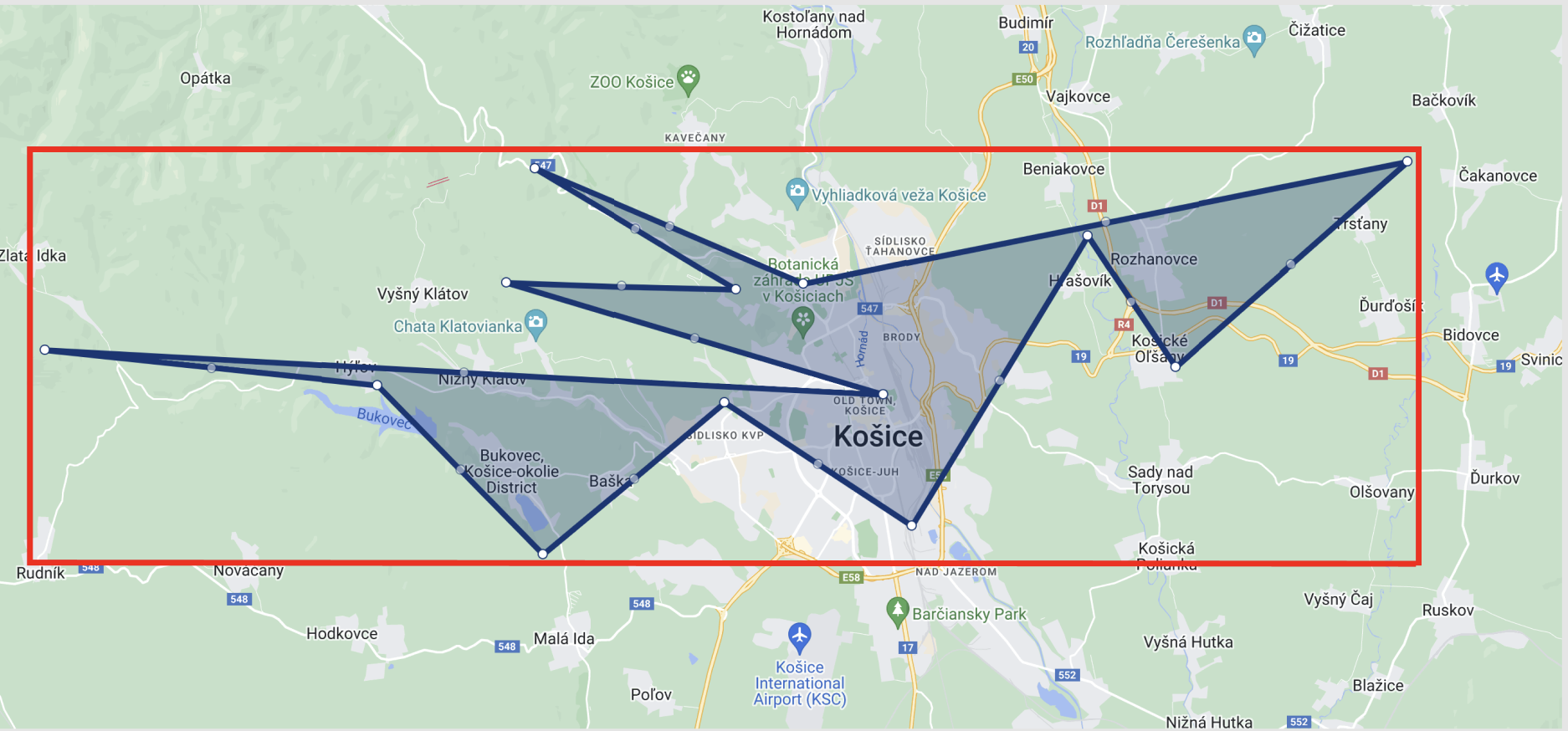
Creating controlled Polylines
Drawing polylines is very similar to drawing polygons, moreover, we can define a polyline as an open polygon. It can also have edges and vertices (if the number of nodes is more than 2) and our approach to creating a controlled polyline element will be quite the same. The part of this article dedicated to the creation of controlled polygons also involves the implementation of the polygon card, where we placed some control elements in order to change polygon properties and exemplify the way such interactive cards can be created. In the rest of the sections, we will be focusing only on drawing since you will be able to replicate the card functionality and apply it to the rest of the drawable elements.
First of all, we need to declare our polylines React state just the way we did that for polygons:
const [distancePolylines, setDistancePolylines] = React.useState< MT.DistancePolylineType[]>([]);Now we need to add the DistancePolylineType to the mapTypes.ts file:
export interface DistancePolylineType { id: number; coordinates: google.maps.LatLngLiteral[]; polylineInstance: google.maps.Polyline | null;}You may have noticed that DistancePolylineType is somewhat simpler than PolygonType - this is so because we won't have the undo functionality, thus we don't need to store previous coordinates, and we also won't change polyline options, meaning there is no need to store their actual values.
Now we need to add to the onOverlayComplete callback of the DrawingManager the similar logic of removing a polyline instance after the drawing is finished and extracting its coordinates in order to render a controlled polyline via the Polyline module from @react-google-maps/api:
if (type === google.maps.drawing.OverlayType.POLYLINE) {  const typedOverlay = overlay as google.maps.Polyline;  const coordinateFuncs: google.maps.LatLng[] = typedOverlay    .getPath()    .getArray();
  const coordinates =    coordinateFuncsToCoordinates(coordinateFuncs);
  if (coordinates.length < POLYLINE_NODES_MIN_QUANTITY) {    return;  }
  setDistancePolylines((prevPolylines) => [    ...prevPolylines,    {      id: R.inc(distancePolylines.length),      coordinates,      polylineInstance: null,    },  ]);
  resetDrawingToolsMode();}
This condition is very similar to what we had with our polygons, the only difference is that now we use the distancePolylines state to store polyline items. We also don't want to create a polyline in case only 1 node exists, because obviously having just 1 node on the map is not what you expect from a polyline element. That is why we need to check the length of the coordinates array. And let's also declare the POLYLINE_NODES_MIN_QUANTITY constant at the very top of our Map component:
const POLYLINE_NODES_MIN_QUANTITY = 2;We can now pass the Polyline module to the GoogleMap as children:
{  distancePolylines.map((polyline) => (    <Polyline      editable      draggable      key={polyline.id}      path={polyline.coordinates}      onLoad={(polylineInstance) => {        polylineInstance.setOptions(PolylineOptions);
        setDistancePolylines((prevPolylines) => {          const [polylinesWithoutLast, lastPolyline] =            dropAndReturnLastElement(prevPolylines);
          return [            ...polylinesWithoutLast,            { ...lastPolyline, polylineInstance },          ];        });      }}      onMouseUp={(event) => {        const { polylineInstance } = polyline;
        if (polylineInstance) {          const coordinateFuncs: google.maps.LatLng[] = polylineInstance            .getPath()            .getArray();
          const currentCoordinates =            coordinateFuncsToCoordinates(coordinateFuncs);
          const { isClickedOnEdgeOrVertex, vertexWithChangedCoordinates } =            processOnVertexOrEdgeClick({              event,              currentCoordinates,              prevCoordinates: polyline.coordinates,            });
          if (isClickedOnEdgeOrVertex && vertexWithChangedCoordinates) {            handleChangePolylineCoordinates({              id: polyline.id,              coordinates: currentCoordinates,            });          }        }      }}      onDragEnd={() => {        const { polylineInstance } = polyline;
        if (polylineInstance) {          const coordinateFuncs: google.maps.LatLng[] = polylineInstance            .getPath()            .getArray();
          const currentCoordinates =            coordinateFuncsToCoordinates(coordinateFuncs);
          handleChangePolylineCoordinates({            id: polyline.id,            coordinates: currentCoordinates,          });        }      }}    />  ));}
And again, when the polyline is rendered for the first time, the logic in the onLoad callback is triggered - we need it to update the respective polyline item from the distancePolylines state with the newly obtained polylineInstance and use the setOptions method to set our predefined PolylineOptions from the config.
We also implement the onMouseUp callback to differentiate between click types and find out whether an edge or a vertex of our polyline was dragged (reusing processOnVertexOrEdgeClick). If yes, we then call our handleChangePolylineCoordinates which updates the distancePolylines state with the changed coordinates; the same logic is applied to the onDragEnd callback. Let's declare our handleChangePolylineCoordinates function inside the Map component:
const handleChangePolylineCoordinates = ({  id,  coordinates,}: {  id: number,  coordinates: google.maps.LatLngLiteral[],}) => {  setDistancePolylines((prevPolylines) => {    const [polylinesWithoutCurrent, currentPolyline] = dropAndReturnElementById(      {        id,        elements: prevPolylines,      }    );
    return R.append(      {        ...currentPolyline,        coordinates,      },      polylinesWithoutCurrent    );  });};
Creating controlled Circles
In order to draw controlled circles we need to follow the same steps, but circles themselves use a bit different data - we need to define center coordinates and a radius instead of an array of coordinates that were required for polygons and polylines.
Let's begin by declaring circles React state:
const [circles, setCircles] = React.useState<MT.CircleType[]>([]);We also need to declare CircleType inside our mapTypes.ts file:
export interface CircleType { id: number; radius: number; center: google.maps.LatLng; circleInstance: google.maps.Circle | null;}Now, as usual, we need to add the last if statement to the onOverlayComplete callback of the DrawingManager:
if (type === google.maps.drawing.OverlayType.CIRCLE) {  const typedOverlay = overlay as google.maps.Circle;  const center = typedOverlay.getCenter();  const radius = typedOverlay.getRadius();
  if (center) {    setCircles((prevCircles) => [      ...prevCircles,      {        center,        radius,        circleInstance: null,        id: R.inc(circles.length),      },    ]);  }
  resetDrawingToolsMode();
  return;}
Here we have the same logic we used for polygons and polylines, and, as mentioned above, we should extract the center coordinates and radius of the newly drawn circle element via getCenter and getRadius.
Circles don't have vertices or edges, and thus our logic for updating circle items inside the circles state will be a bit different: we just need to implement a function that will be called in 2 callbacks: onRadiusChanged and onCenterChanged. So, let's declare handleSetCircleDataOnCoordinatesChange inside our Map component:
const handleSetCircleDataOnCoordinatesChange = (circle: MT.CircleType) => {  const { circleInstance } = circle;  const radius = circleInstance?.getRadius();  const center = circleInstance?.getCenter();
  if (circleInstance && radius && center) {    setCircles((prevCircles) => {      const [circlesWithoutCurrent] = dropAndReturnElementById({        id: circle.id,        elements: prevCircles,      });
      return R.append(        {          ...circle,          radius,          center,        },        circlesWithoutCurrent      );    });  }};
As you can see, the function uses the circleInstance in order to get the newly changed radius and center coordinates and then updates the respective item in the circles state.
Finally, we can pass our Circle module to GoogleMap as children:
{  circles.map((circle) => (    <Circle      editable      key={circle.id}      center={circle.center}      radius={circle.radius}      onLoad={(circleInstance) => {        circleInstance.setOptions(CircleOptions);
        setCircles((prevCircles) => {          const [circlesWithoutLast, lastCircle] =            dropAndReturnLastElement(prevCircles);
          return [...circlesWithoutLast, { ...lastCircle, circleInstance }];        });      }}      onRadiusChanged={() => {        handleSetCircleDataOnCoordinatesChange(circle);      }}      onCenterChanged={() => {        handleSetCircleDataOnCoordinatesChange(circle);      }}    />  ));}
Expectedly, the logic of the onLoad callback works the same way as before: we take the newly created circle element from the circles state and update it with the circleInstance retrieved from the rendered Circle module. And, of course, we use the handleSetCircleDataOnCoordinatesChange to update the state if either radius or center coordinates get changed.

Summary
This article demonstrates how the Google Drawing Manager can be used to draw elements in your React project. We have also covered all the main obstacles you can face when implementing this functionality, e.g., @react-google-maps/api does not natively provide an easy way to modify your elements (polylines, polygons, and circles), and the resulting element represents a black box with limited functionality. We have learned how to create a controlled element: we use the Google Drawing Manager just for drawing and extracting the coordinates from the newly created element, and then clear its instance and render this element via a respective module and use the extracted coordinates to place the element correctly on the map. We also replicated all the core functionality, such as dragging and modifying our elements, implemented the undo button functionality for our polygons, and added a nice card to change their props, such as color, border color, and width.
The code for a complete project can be found here - you can use it as a playground and experiment with different modules and settings. Please, don't forget to create the .env.development file in the root of your project and place a valid API key there: GATSBY_GOOGLE_KEY='your valid key'.


